
Heritage and Modernity in a Social-First Brand
Launching a Distinctive Social Presence for Urban Men
Digi‑Barber launched with a visually distinctive social media presence that communicated British heritage while appealing to young, busy, cosmopolitan men. The project moved the brand away from generic promotional graphics that lacked personality, establishing a polished, culturally resonant identity that fused heritage cues with modern design. The result was higher engagement, early app adoption, and a social presence that made the app instantly recognisable and desirable.
Project Overview
The Client at a Glance
Digi‑Barber is a UK-based tech startup delivering a mobile app that allows users to book barber appointments quickly while connecting them with local barbers.
At launch, the studio aimed to establish a compelling visual identity and attract early adopters. They are unique in their approach, blending British barbering heritage with a tech-forward, cosmopolitan perspective. This combination allowed Dawn Media to explore creative, culturally aware visual storytelling that resonated with a young, urban audience.

01
The Challenge
Before the project, social media graphics were inconsistent, generic, and lacked personality. They did not connect with the brand’s cultural roots or the lifestyle aspirations of the target demographic: urban, style-conscious men.
Without intervention, the app risked entering a competitive market without a visual anchor, failing to capture attention or convey authenticity. Instagram content felt disconnected from UK barbering traditions and missed the opportunity to position the brand as both aspirational and approachable.
02
The Insight
A strong launch required more than visibility. The brand needed graphics that fused heritage cues with a contemporary, cosmopolitan aesthetic. The challenge was aspirational alignment: the visuals had to make the app feel authentic, relevant, and desirable to busy, modern men.
03
The Strategy
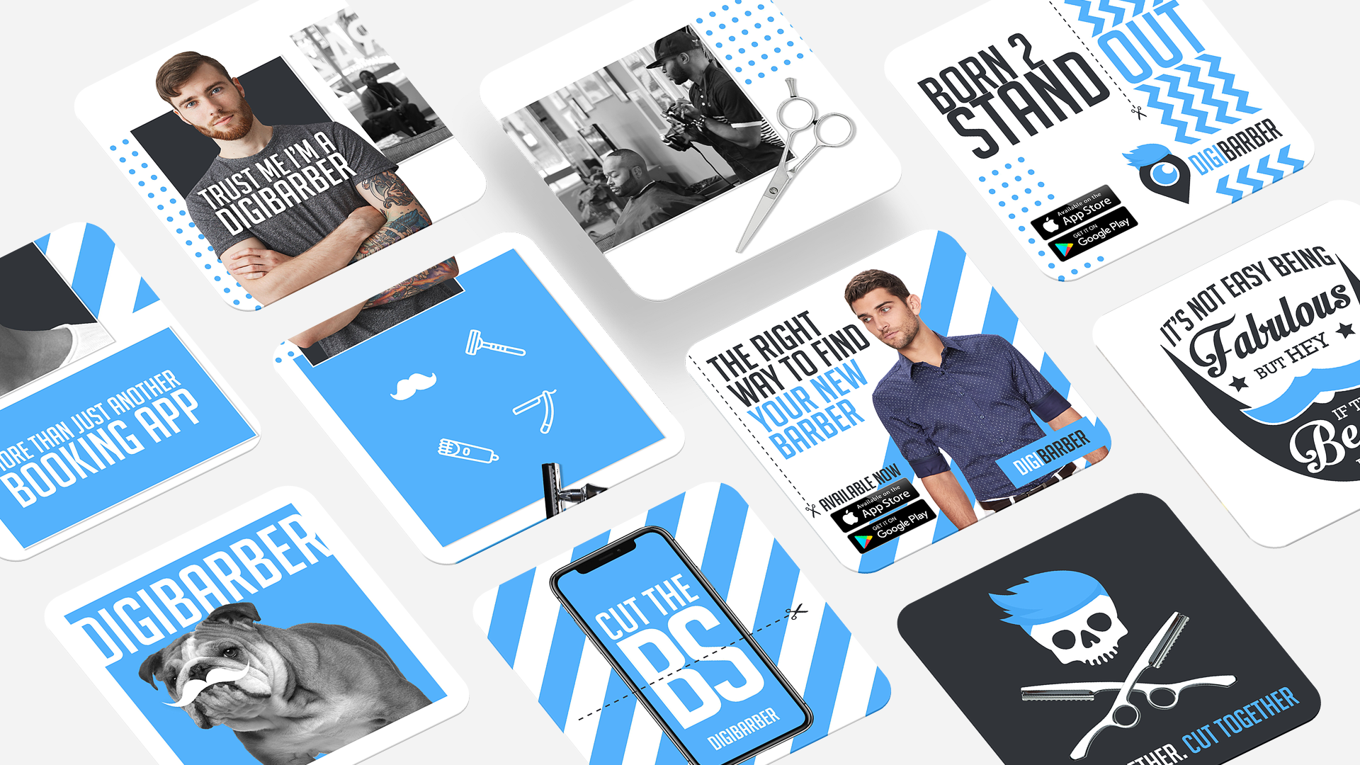
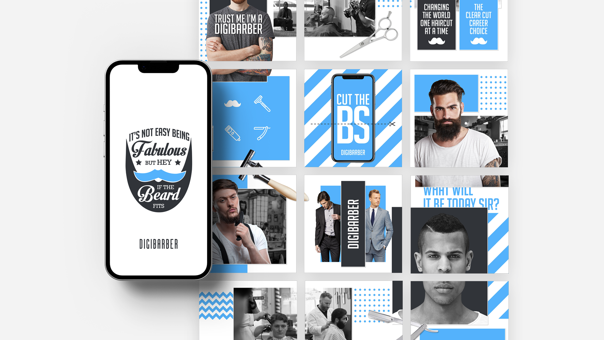
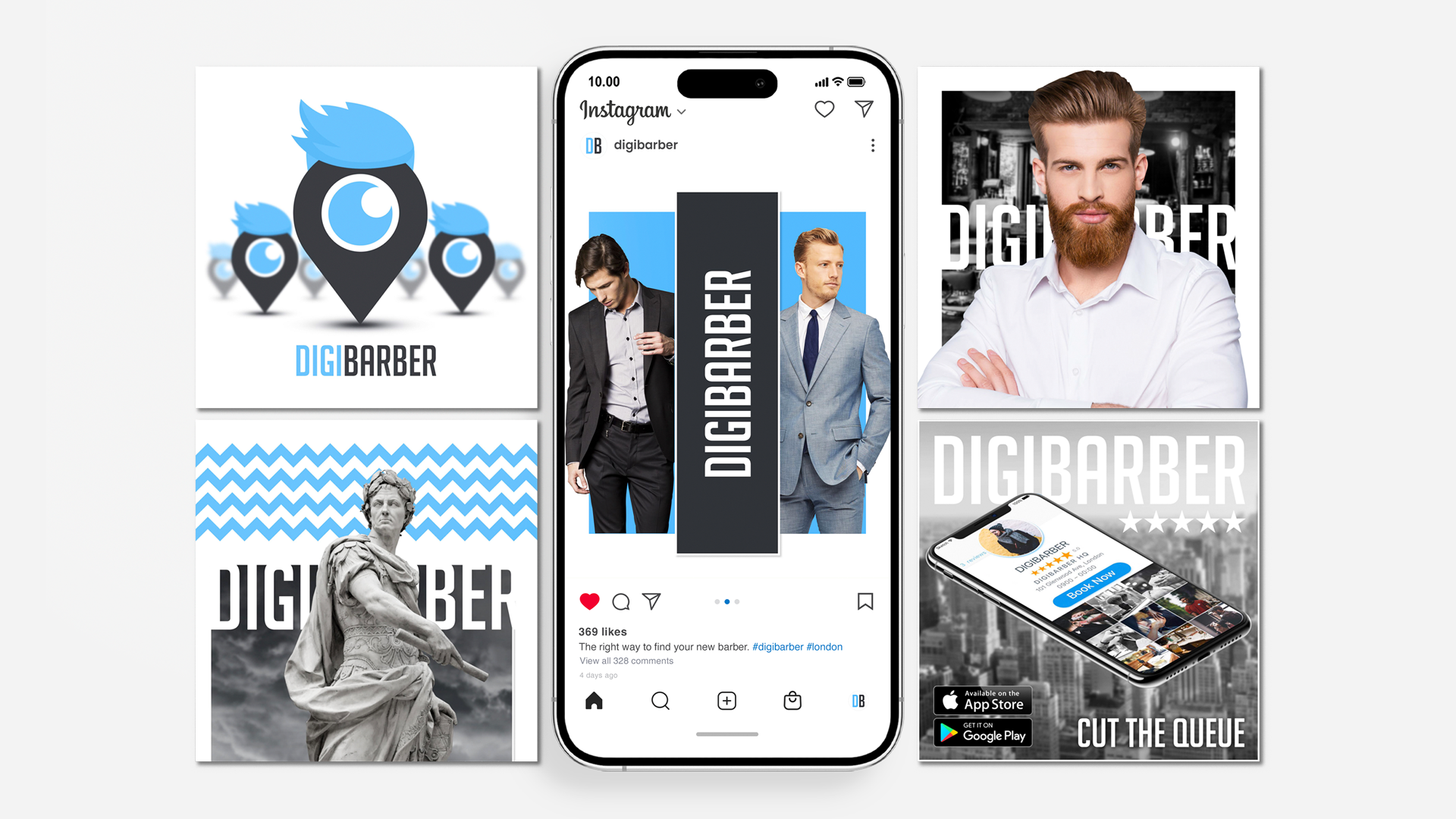
We created high-impact, Instagram-ready graphics that combined British heritage elements with contemporary design aesthetics.
We avoided generic tech app visuals or overly retro cues that could feel outdated. The goal was not only to look good but to feel culturally relevant. Success needed to communicate trust, authenticity, and modern style while engaging a highly visual audience.
From Insight to Execution
Selected Work
Translate Strategy Into Form
Creative Intelligence
Visual system overview
01
Post-project, the brand is modern, stylish, culturally aware, and unmistakably British. The social presence is bold, consistent, and highly visible, allowing the brand to compete in both heritage-conscious and tech-forward spaces.
Key design decisions and rationale
02
Simpler, minimalist, or purely tech-focused designs were tested but rejected for feeling cold and disconnected from the app’s heritage and audience. We committed to a hybrid approach: contemporary layouts, vibrant color accents, and subtle British cues in typography, color palette, and iconography. This approach balanced tradition with modernity and created a distinct, recognisable style.
Tone, typography, color, imagery, motion, etc.
03
The visual system reinforces strategic intent by merging British heritage cues with dynamic, high-impact graphics. Every post aligns cultural identity with aspirational urban design, delivering a coherent, memorable social presence that encourages engagement and app adoption. Visual consistency ensures the brand feels both trustworthy and modern across all social touchpoints.
How the execution supports the strategy
04
The visual language is vibrant, clean, and contemporary, infused with heritage-inspired details. Typography is bold yet structured. Imagery evokes the lifestyle of young urban men while maintaining clarity and legibility across mobile platforms. Every element was designed to be Instagram-ready, eye-catching, and culturally resonant.
Design Impact
The Outcome
Digi‑Barber launched with a visually coherent, culturally resonant social media presence. Awareness and engagement among target users increased immediately.
Feedback highlighted that the graphics felt authentically British while appealing to contemporary men, helping the app differentiate itself in a crowded market. Short-term results included higher engagement, early downloads, and a credible, stylish brand image. Long-term, the project provides a foundation for consistent branding, scalable content creation, and ongoing user growth.
What Our Clients Think
Testimonials
-
![]()
★★★★★
They understood the heritage and symbolism I wanted to preserve, and translated that into a brand that feels elevated, authentic, and enduring.
—Aiste, GIJA LT
-
![]()
★★★★★
They took time to understand what my business is really about—security, trust, and professionalism—and built a brand around that. No fluff, just clean, sharp work that actually helps me stand out.
—Dan, Ambervalley Locksmiths
-
![]()
★★★★★
Dawn Media was the first design agency that didn’t try to simplify or water down my mission. They genuinely cared about the preservation of these beautiful creatures.
—Dora, Fox Guardians
-
![]()
★★★★★
The work was meticulous—everything clean, realistic, and on-brand. Turnarounds were fast, and communication was clear throughout. They deliver consistently and makes our lives easier.
—Ryder, Unsworth Sugden
-
![]()
★★★★★
The look they created is smart but not flashy, and it feels solid—like us. It’s helped us look more professional without losing that family-run feel people trust us for.
—Paul, Superior Stoves
-
![]()
★★★★★
Dawn Media was lovely to work with, they really listened, asked the right questions, and somehow turned all my scattered ideas into something beautiful and cohesive.
—Jodie, Jodie's Bakehouse
-
![]()
★★★★★
The visuals are sharp, bold, and full of movement—and they reflect my style as a coach. It gave me a huge confidence boost, and clients are responding to it.
—Maria, Maria Marikiya PT
-
![]()
★★★★★
Dawn Media has a remarkable way of translating abstract ideas into practical, elegant design. Their team helped me define AnGlophone Go’s unique position and brought clarity to how we communicate that—visually and online.
—Elena, AnGlophone Go
-
![]()
★★★★★
Building the Real English brand with Dawn Media was a game-changer. They helped me refine not just how we look, but how we show up in the world—on social media, on our site, and in how we speak to our audience.
—Charlotte, The Real English Center


Anchor The Narrative
Key Takeaway / Thesis
Cultural resonance combined with contemporary design drives relevance. Heritage cues are meaningful only when thoughtfully integrated for the audience.
Future iterations will continue blending identity-driven design with audience-centered aesthetics to maximise engagement. Expanding into interactive content and short-form video will complement the static heritage-inspired graphics, extending reach and deepening audience connection.
The Phoenix Rises
Awaken Your Brand
You’ve seen how we think. You’ve felt the difference in our approach. Now, the path forward is clear. If you’re ready to transform your brand into a force that leads, resonates, and endures. Carpe diem, seize the day.
Let’s begin your digital transformation.