
Immediate Relevance and Credibility
Elevating Cybersecurity Marketing with Cyberpunk Visuals
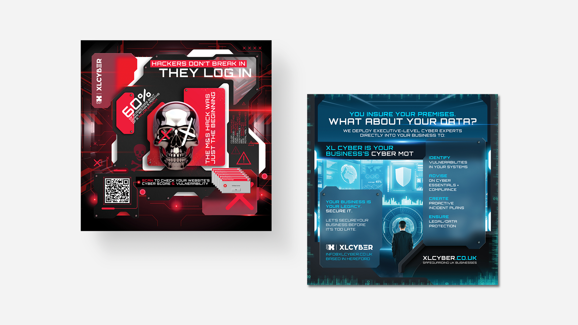
DK Designer transformed a conventional cybersecurity campaign into a visually distinctive experience by integrating specialist illustration into the design system. The campaign moved from generic marketing layouts to a cinematic, cyberpunk-inspired environment that made digital threats tangible and elevated technical credibility. The result was a cohesive visual language that captured attention while reinforcing the seriousness and sophistication of the subject matter.
Project Overview
The Client at a Glance
DK Designer is an independent UK-based design studio delivering branding, marketing, and digital design services across industries. The studio operates as a senior-led freelance practice, assembling specialist creatives when projects require technical or highly specialised skill sets.
Their approach combines decades of design experience with a flexible model, allowing them to match the right expertise to each project. This balance of strategic insight and adaptable execution makes them a strong and interesting client. They deliver high-quality design solutions while maintaining the agility of a boutique studio.

01
The Challenge
The campaign required a highly specialised visual style to communicate digital threats, data hacking, and cybersecurity concepts in a compelling way. Traditional graphic design approaches lacked the narrative depth necessary for this complex topic.
Without a distinctive visual anchor, the campaign risked falling into generic cybersecurity marketing, relying on stock imagery and abstract technical visuals. The project demanded a focal visual capable of communicating a complex technological message quickly and memorably within a single asset.
02
The Insight
Cybersecurity is inherently invisible. The challenge was not simply to illustrate concepts but to visualise a digital environment where threats and protection coexist.
The deeper issue was the need for a visual metaphor. Abstract cyber threats must be rendered into a tangible, atmospheric, and recognisable visual story. For success, the illustration had to integrate seamlessly into the broader campaign design while carrying sufficient depth to convey the narrative of digital intrusion and technological vigilance.
03
The Strategy
The strategic decision was to create a cyberpunk-inspired illustration as the central narrative element of the campaign. This approach aligned with DK Designer’s brief while allowing for cinematic, atmospheric storytelling.
We deliberately avoided overcomplicating the visual environment or introducing stylistic elements that could distract from the campaign message. Success needed to feel atmospheric, technological, and slightly tense, reflecting the constant presence of unseen digital threats.
From Insight to Execution
Selected Work
Translate Strategy Into Form
Creative Intelligence
Visual system overview
01
The brand should be perceived as technologically sophisticated and capable of navigating complex digital threats. It required a futuristic, high-tech presence that communicates expertise and vigilance within the cybersecurity landscape.
Key design decisions and rationale
02
Conventional technology visuals were rejected for their lack of narrative depth. Instead, we committed to a cyberpunk environment featuring neon lighting, digital interfaces, and layered depth. This aesthetic directly reflects the cultural imagery associated with hacking and digital networks, providing immediate differentiation within the sector.
Tone, typography, color, imagery, motion, etc.
03
The design reinforces strategy by creating a visual metaphor for cybersecurity: a stylised digital world where intrusion and defence coexist. Strategy and execution converge in the environmental storytelling. Layered architecture, lighting, and composition convey an active technological ecosystem, transforming abstract concepts into tangible narrative imagery.
How the execution supports the strategy
04
The visual language is cinematic, defined by neon contrasts, layered textures, and atmospheric lighting. The illustration maintains richness while preserving compositional clarity so that copy and layout integrate cleanly.
Design Impact
The Outcome
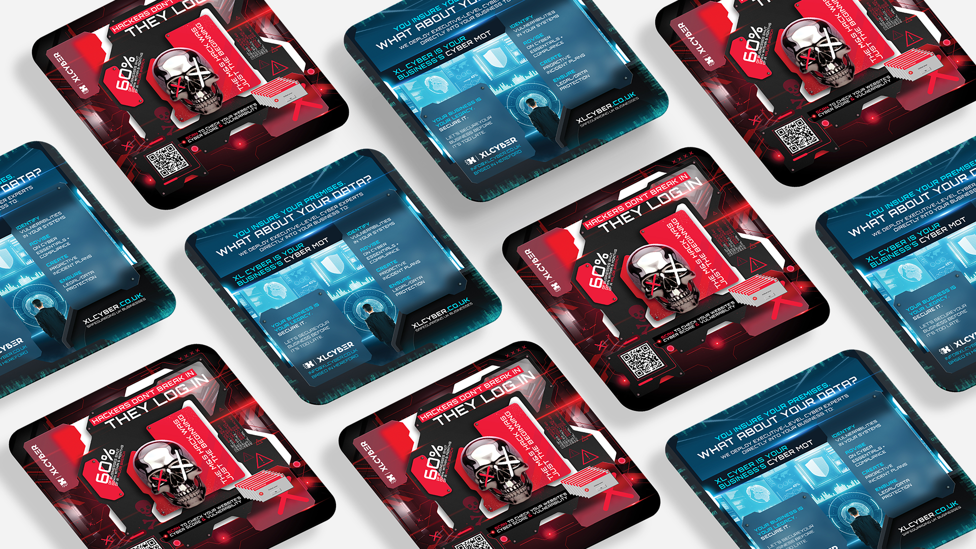
The project delivered a campaign asset that combined strategic layout design with specialist illustration. The cyberpunk aesthetic created immediate visual impact, setting the campaign apart from conventional cybersecurity marketing materials.
Short-term, the campaign captured attention and reinforced the client’s technological credibility. Long-term, it demonstrates the value of collaboration between creative professionals to expand the visual possibilities of technical campaigns.
What Our Clients Think
Testimonials
-
![]()
★★★★★
They understood the heritage and symbolism I wanted to preserve, and translated that into a brand that feels elevated, authentic, and enduring.
—Aiste, GIJA LT
-
![]()
★★★★★
They took time to understand what my business is really about—security, trust, and professionalism—and built a brand around that. No fluff, just clean, sharp work that actually helps me stand out.
—Dan, Ambervalley Locksmiths
-
![]()
★★★★★
Dawn Media was the first design agency that didn’t try to simplify or water down my mission. They genuinely cared about the preservation of these beautiful creatures.
—Dora, Fox Guardians
-
![]()
★★★★★
The work was meticulous—everything clean, realistic, and on-brand. Turnarounds were fast, and communication was clear throughout. They deliver consistently and makes our lives easier.
—Ryder, Unsworth Sugden
-
![]()
★★★★★
The look they created is smart but not flashy, and it feels solid—like us. It’s helped us look more professional without losing that family-run feel people trust us for.
—Paul, Superior Stoves
-
![]()
★★★★★
Dawn Media was lovely to work with, they really listened, asked the right questions, and somehow turned all my scattered ideas into something beautiful and cohesive.
—Jodie, Jodie's Bakehouse
-
![]()
★★★★★
The visuals are sharp, bold, and full of movement—and they reflect my style as a coach. It gave me a huge confidence boost, and clients are responding to it.
—Maria, Maria Marikiya PT
-
![]()
★★★★★
Dawn Media has a remarkable way of translating abstract ideas into practical, elegant design. Their team helped me define AnGlophone Go’s unique position and brought clarity to how we communicate that—visually and online.
—Elena, AnGlophone Go
-
![]()
★★★★★
Building the Real English brand with Dawn Media was a game-changer. They helped me refine not just how we look, but how we show up in the world—on social media, on our site, and in how we speak to our audience.
—Charlotte, The Real English Center


Anchor The Narrative
Key Takeaway / Thesis
This project reinforced that complex technical ideas often require specialised visual storytelling to communicate effectively.
Future projects will continue to prioritise collaboration with specialist creatives when the brief demands expertise beyond standard design execution. There is room to expand the illustrated environment across multiple campaign formats to enhance narrative continuity and reinforce strategic messaging.
The Phoenix Rises
Awaken Your Brand
You’ve seen how we think. You’ve felt the difference in our approach. Now, the path forward is clear. If you’re ready to transform your brand into a force that leads, resonates, and endures. Carpe diem, seize the day.
Let’s begin your digital transformation.