
Immediate Relevance and Credibility
Establishing a Confident Digital Identity for a New Kind of Language Learning
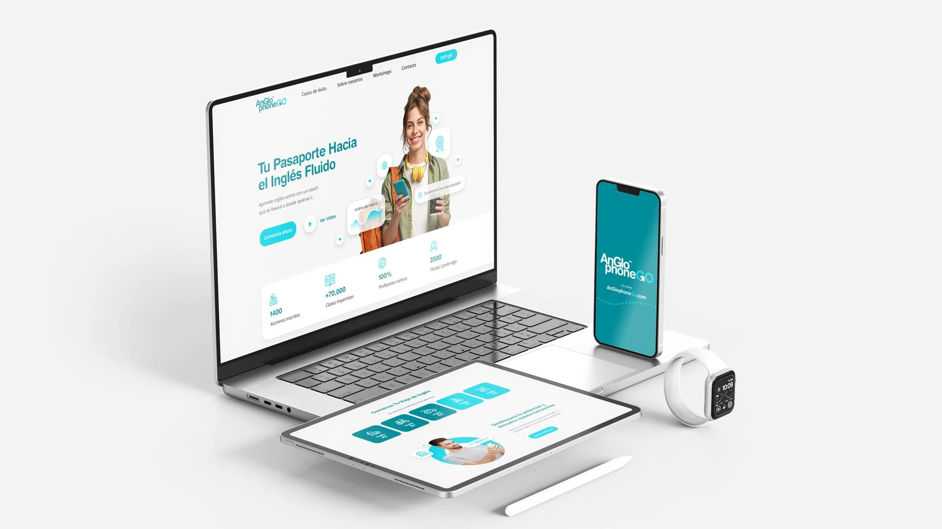
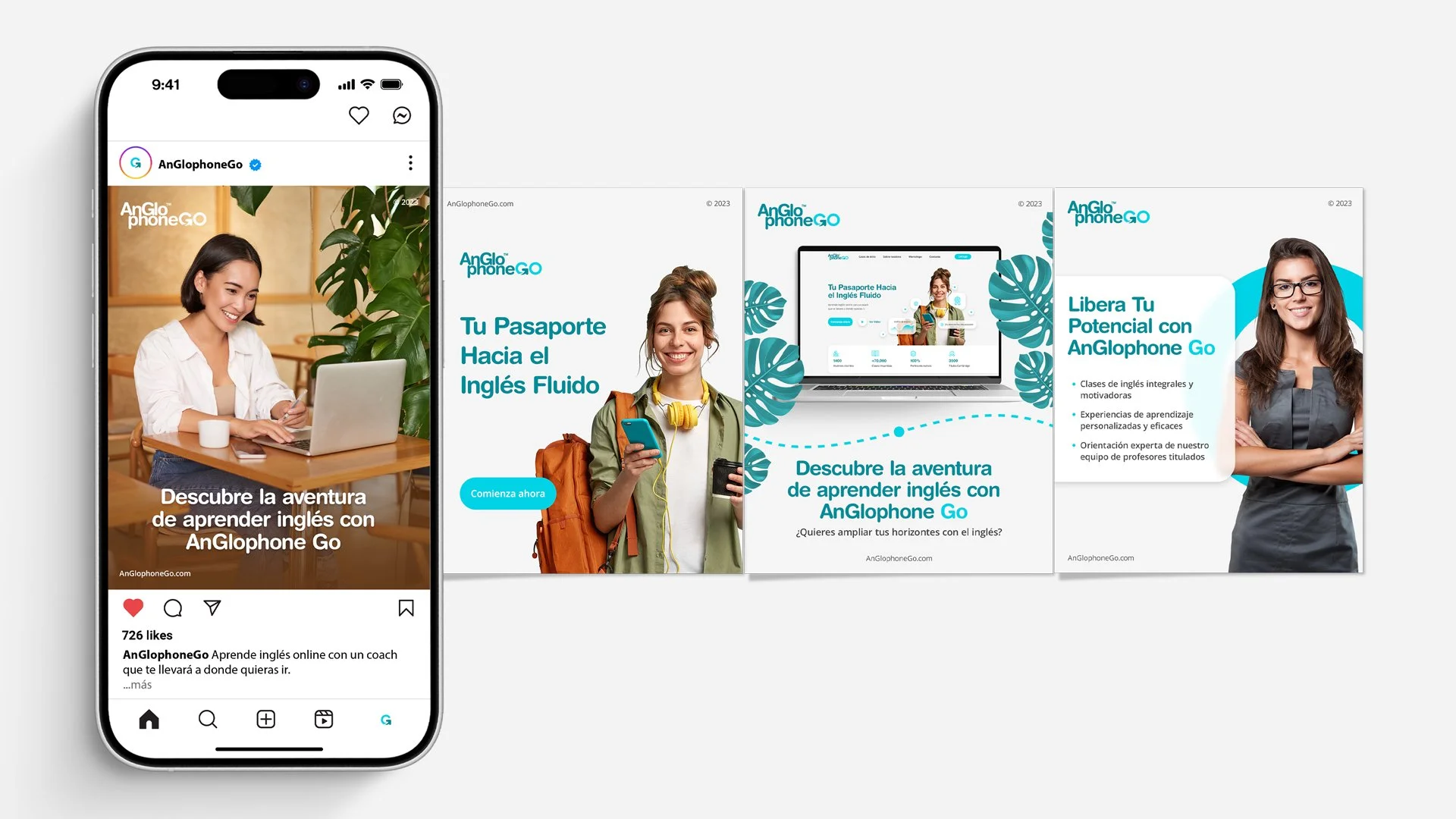
AnGlophone Go transitioned from a functional online offering into a clear, trustworthy brand presence that communicates experience, direction, and purpose from the first interaction.
They moved away from looking templated and provisional, and toward a position of credibility that signals expertise, confidence, and intent to students encountering the brand for the first time.
Project Overview
The Client at a Glance
AnGlophone Go is an online English tuition platform serving Spanish students in Almería, Spain.
While the digital offering was new, the organization behind it was not. The founders also operate multiple physical academies across the region and are deeply embedded in their local community. AnGlophone has long standing trust offline. The challenge was translating that legitimacy into a digital first experience.
They were at the beginning of their online journey, but not at the beginning of their story.

01
The Challenge
AnGlophone Go had a service, but not yet a position. The early focus leaned heavily toward academic explanation, what was taught, how it worked, and why it was effective, without clarity around who the service was really for or why it mattered in the student’s life.
The risk was subtle but significant. Without a clear emotional frame, online traffic would struggle to convert. The service could appear interchangeable. Interest could dissolve into hesitation. In the real world, this showed up as confusion. Visitors understood the mechanics, but not the meaning.
02
The Insight
The breakthrough came from reframing the audience. Students were not simply seeking instruction. They were responding to an underlying motivation: movement, curiosity, expansion. English represented access to travel, independence, new cultures, and broader perspective.
The issue was not the quality of teaching. It was that the brand was speaking to everyone in the same way, while the students were driven by a shared emotional impulse beneath the surface. For the project to succeed, the identity needed to align with that impulse. Learning had to be positioned not as an end, but as a gateway.
03
The Strategy
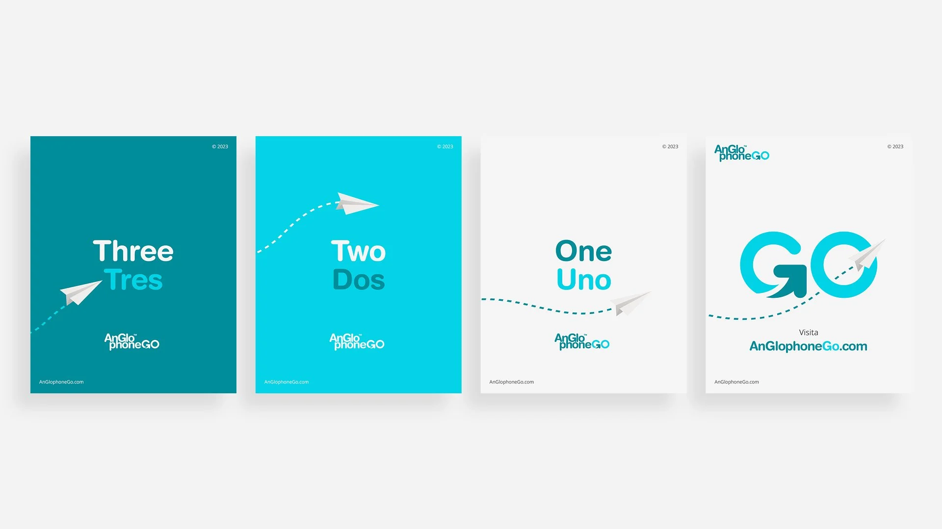
The core decision was to anchor the brand in the Explorer archetype. This meant designing an identity that felt modern, open, and forward looking. Less institutional, more invitational. English would be framed as something to use, not simply to master.
Equally important was what we chose not to do. We deliberately avoided visual and conceptual references common to traditional English schools and academic institutions. Familiarity would have softened impact. Distinction required restraint. Success needed to feel emotionally relevant. When students saw the brand, it had to reflect their own desire for momentum and possibility, not just competence.
From Insight to Execution
Selected Work

Translate Strategy Into Form
Creative Intelligence
Visual system overview
01
The brand needed to be perceived as aligned with students’ deeper aspirations: growth, exploration, and self expansion. Its presence had to feel light, flexible, and approachable. Confident without heaviness. A platform that felt like a starting point, not a gatekeeper.
Key design decisions and rationale
02
Early exploration considered a more authoritative, mastery led direction. While intellectually sound, it placed the brand above the audience rather than alongside them.
The final commitment to the Explorer archetype proved stronger. It mirrored how students saw their future. English became a tool for movement, not a subject confined to structure.
This choice shifted perception. The academy no longer felt like an institution delivering knowledge, but a launch point enabling experience. That shift created resonance and invitation.
Tone, typography, color, imagery, motion, etc.
03
Every design decision reinforced the idea of movement and exploration.
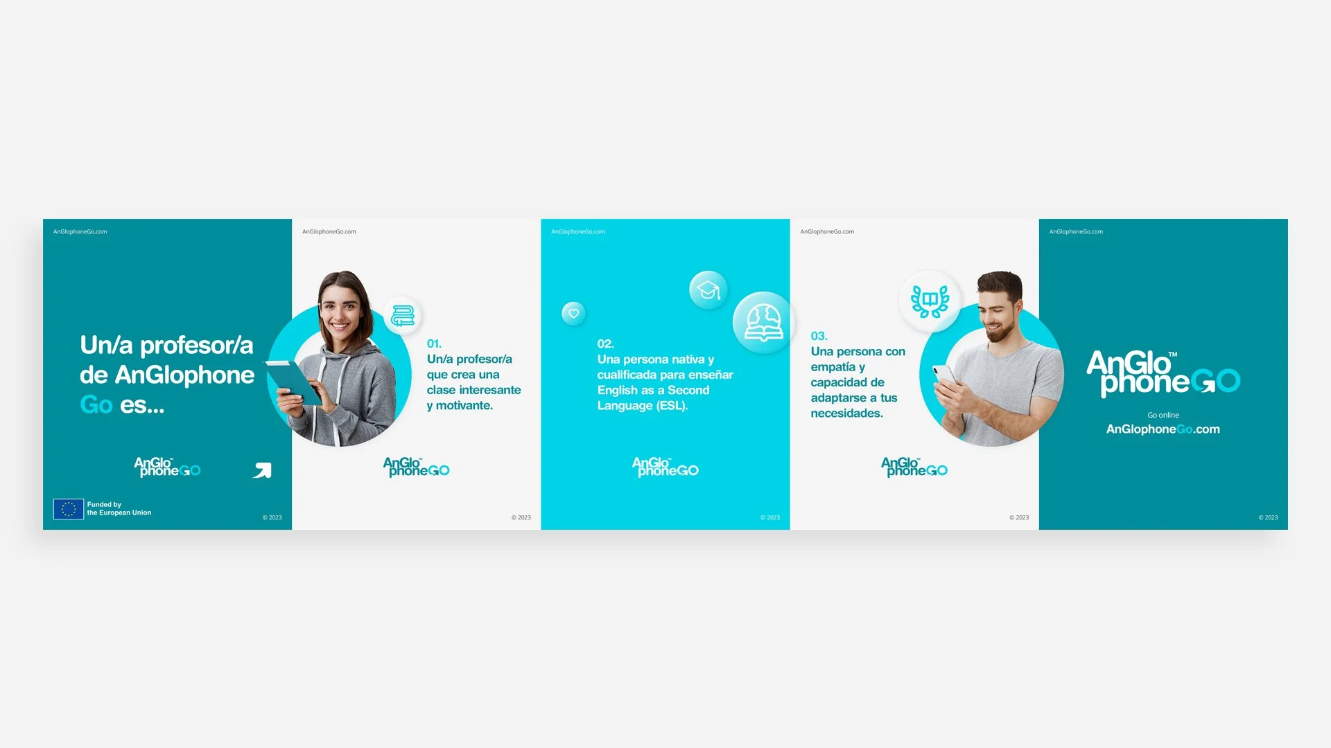
Rounded typography and playful iconography softened the experience. Tropical illustrations, dotted map like lines, and directional motifs subtly suggested travel and progression.
Photography consistently depicted students in motion, often with backpacks, visually reinforcing the idea that language is something carried into the world, not kept inside a classroom.
This is where strategy and execution fully converged.
How the execution supports the strategy
04
The visual language was defined by clarity and restraint. Calm confidence. Human centered simplicity.
We retained AnGlophone’s existing color palette from their physical academies to preserve continuity across environments. The system remained intentionally light, allowing the brand to breathe and adapt across platforms.
Design Impact
The Outcome
Following launch, AnGlophone Go saw increased visibility, higher traffic, and a measurable shift in perception.
Students responded positively. Feedback consistently reflected recognition: this feels like it’s for me. Enrolment spiked in the short term, validating the repositioning.
More importantly, the project established a digital foundation that extends beyond a single website. AnGlophone is no longer bound to physical space. The brand now exists as a scalable, adaptable presence capable of supporting future platforms, services, and opportunities.
What Our Clients Think
Testimonials
-
![]()
★★★★★
They understood the heritage and symbolism I wanted to preserve, and translated that into a brand that feels elevated, authentic, and enduring.
—Aiste, GIJA LT
-
![]()
★★★★★
They took time to understand what my business is really about—security, trust, and professionalism—and built a brand around that. No fluff, just clean, sharp work that actually helps me stand out.
—Dan, Ambervalley Locksmiths
-
![]()
★★★★★
Dawn Media was the first design agency that didn’t try to simplify or water down my mission. They genuinely cared about the preservation of these beautiful creatures.
—Dora, Fox Guardians
-
![]()
★★★★★
The work was meticulous—everything clean, realistic, and on-brand. Turnarounds were fast, and communication was clear throughout. They deliver consistently and makes our lives easier.
—Ryder, Unsworth Sugden
-
![]()
★★★★★
The look they created is smart but not flashy, and it feels solid—like us. It’s helped us look more professional without losing that family-run feel people trust us for.
—Paul, Superior Stoves
-
![]()
★★★★★
Dawn Media was lovely to work with, they really listened, asked the right questions, and somehow turned all my scattered ideas into something beautiful and cohesive.
—Jodie, Jodie's Bakehouse
-
![]()
★★★★★
The visuals are sharp, bold, and full of movement—and they reflect my style as a coach. It gave me a huge confidence boost, and clients are responding to it.
—Maria, Maria Marikiya PT
-
![]()
★★★★★
Dawn Media has a remarkable way of translating abstract ideas into practical, elegant design. Their team helped me define AnGlophone Go’s unique position and brought clarity to how we communicate that—visually and online.
—Elena, AnGlophone Go
-
![]()
★★★★★
Building the Real English brand with Dawn Media was a game-changer. They helped me refine not just how we look, but how we show up in the world—on social media, on our site, and in how we speak to our audience.
—Charlotte, The Real English Center


Anchor The Narrative
Key Takeaway / Thesis
This project reinforced a fundamental truth: Brand archetypes matter.
When identity aligns with motivation, relevance follows naturally. Coherence across touchpoints builds belief faster than explanation ever could. What worked should be repeated. Establish the brand first. Ensure every expression, visual, verbal, digital, moves in the same direction.
What could be refined is depth of listening. More direct conversation with students would further sharpen nuance and precision. When branding is done well, it does not persuade. It reflects, and people recognize themselves inside it.
The Phoenix Rises
Awaken Your Brand
You’ve seen how we think. You’ve felt the difference in our approach. Now, the path forward is clear. If you’re ready to transform your brand into a force that leads, resonates, and endures. Carpe diem, seize the day.
Let’s begin your digital transformation.