
Emotional Resonance and Perceptual Precision
Crafting a Bold, Forward-Thinking Brand Identity
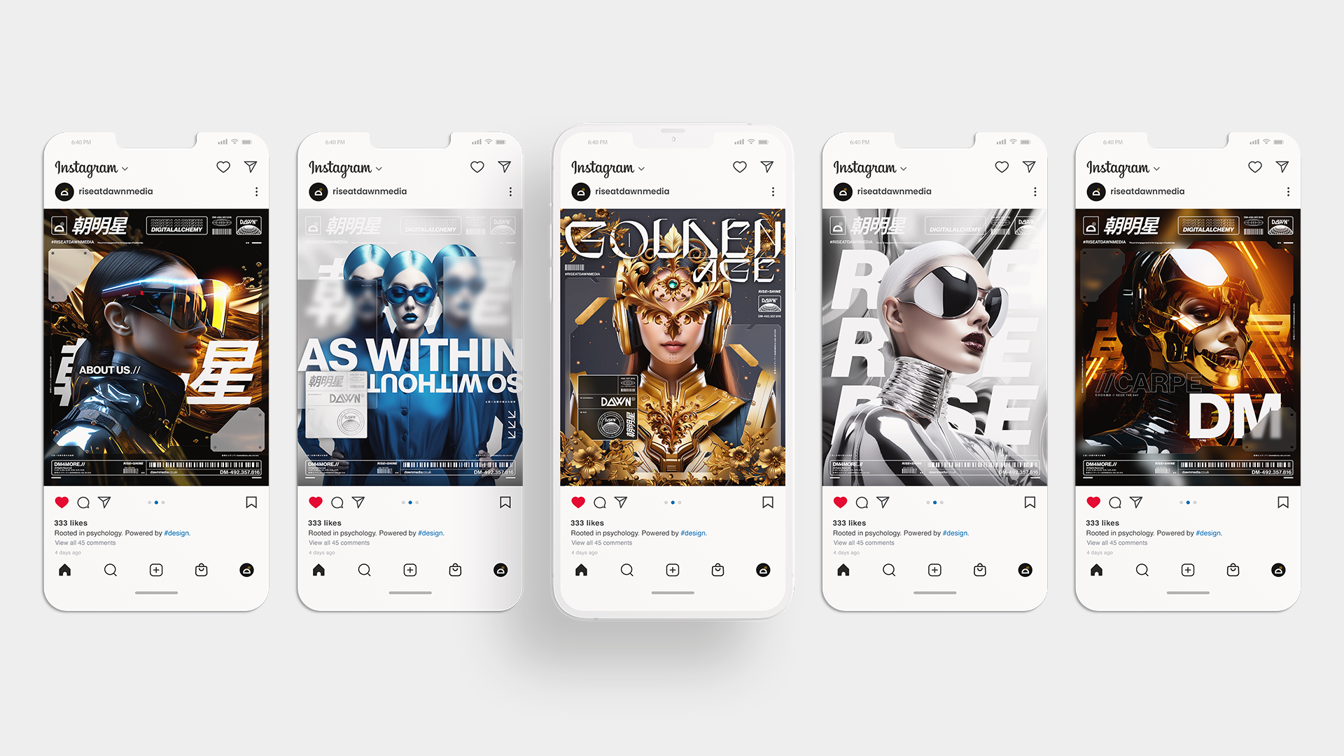
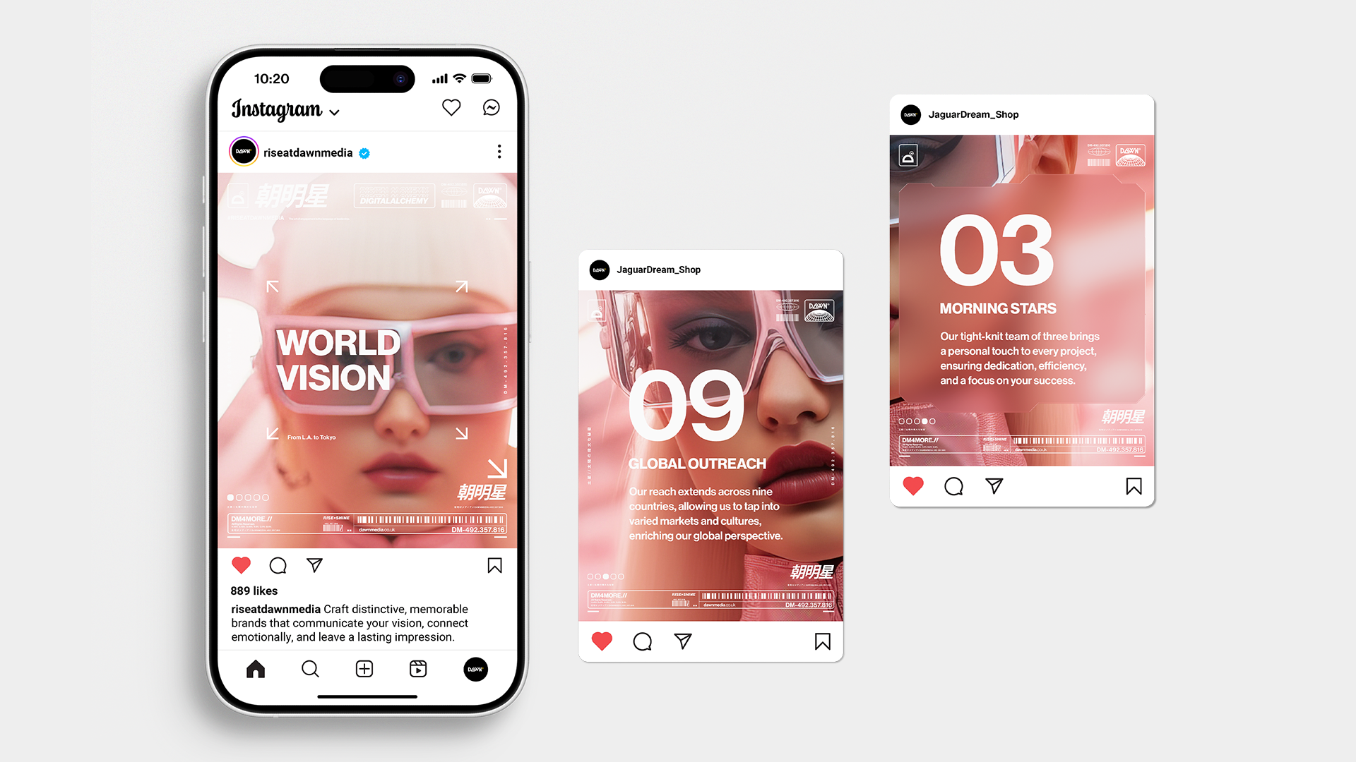
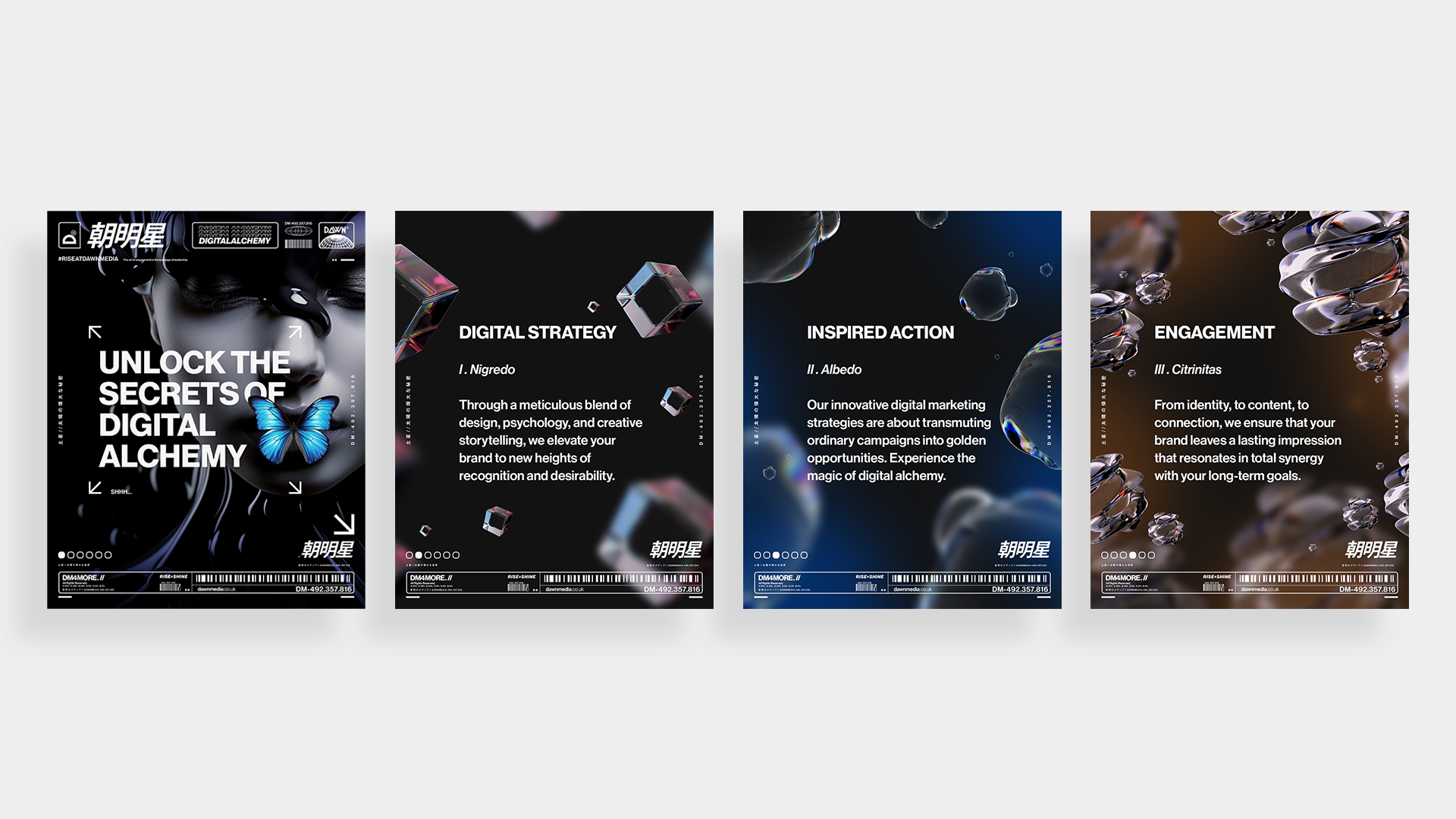
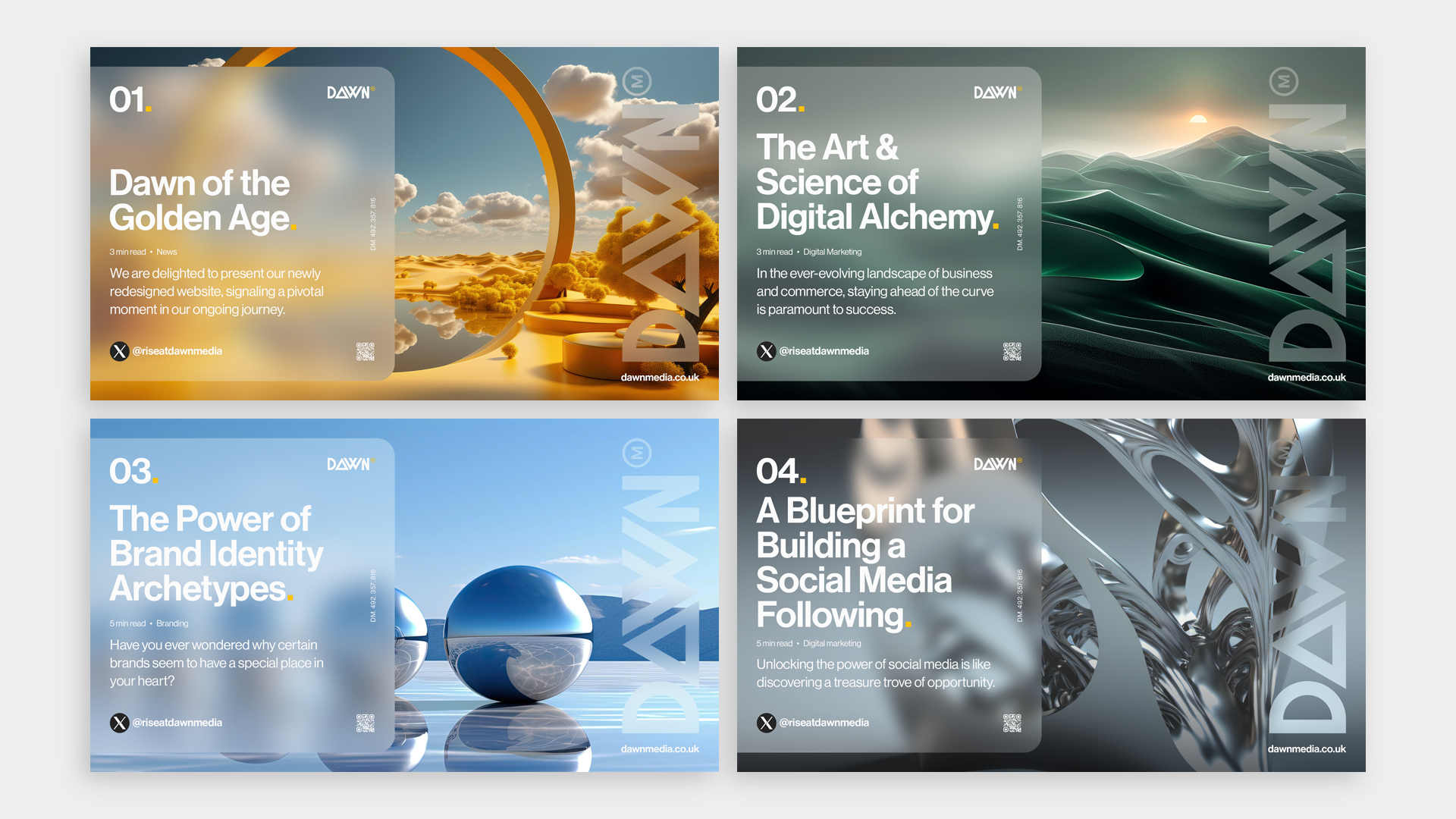
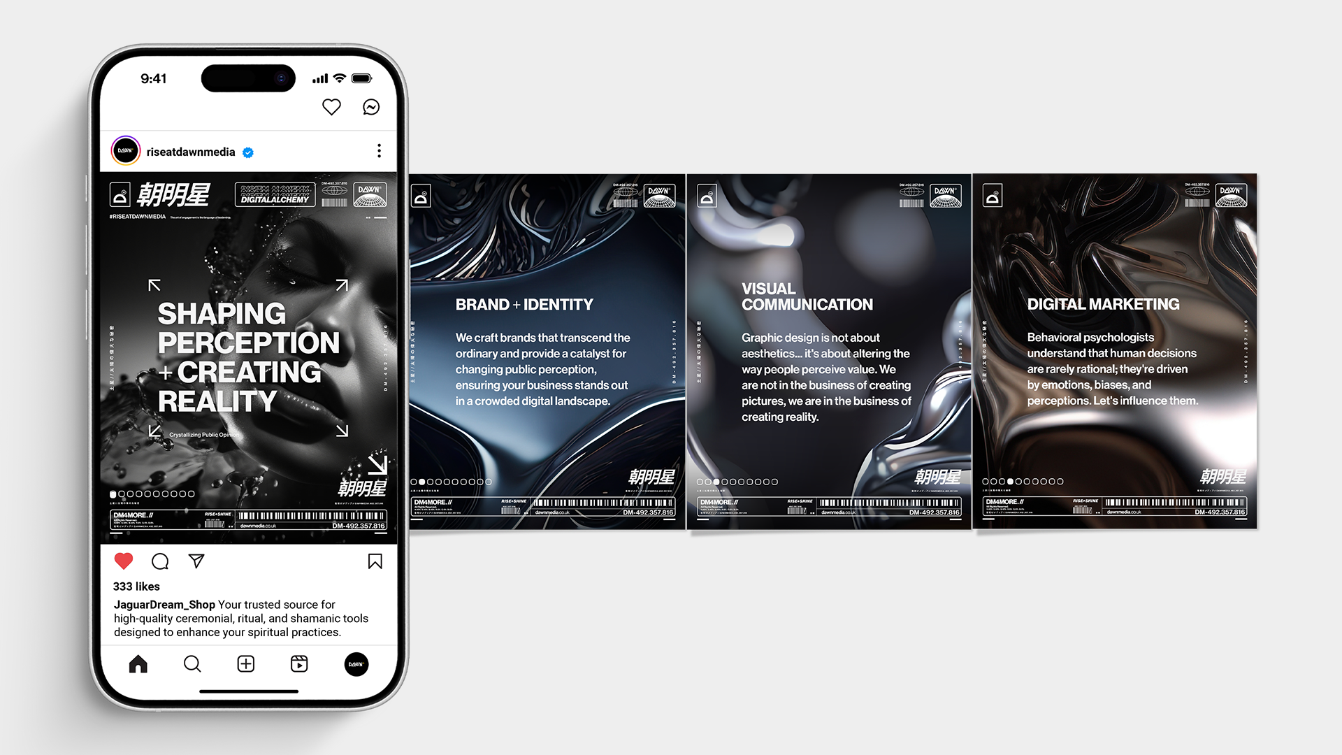
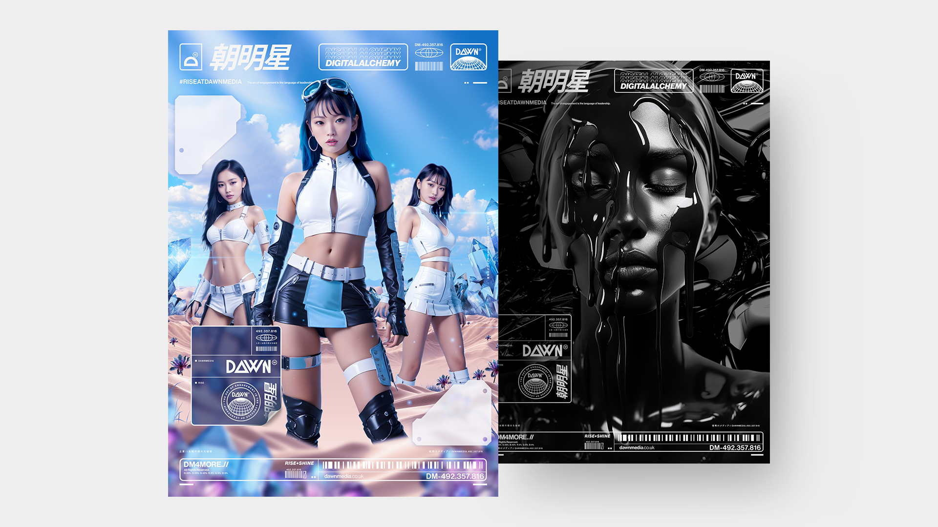
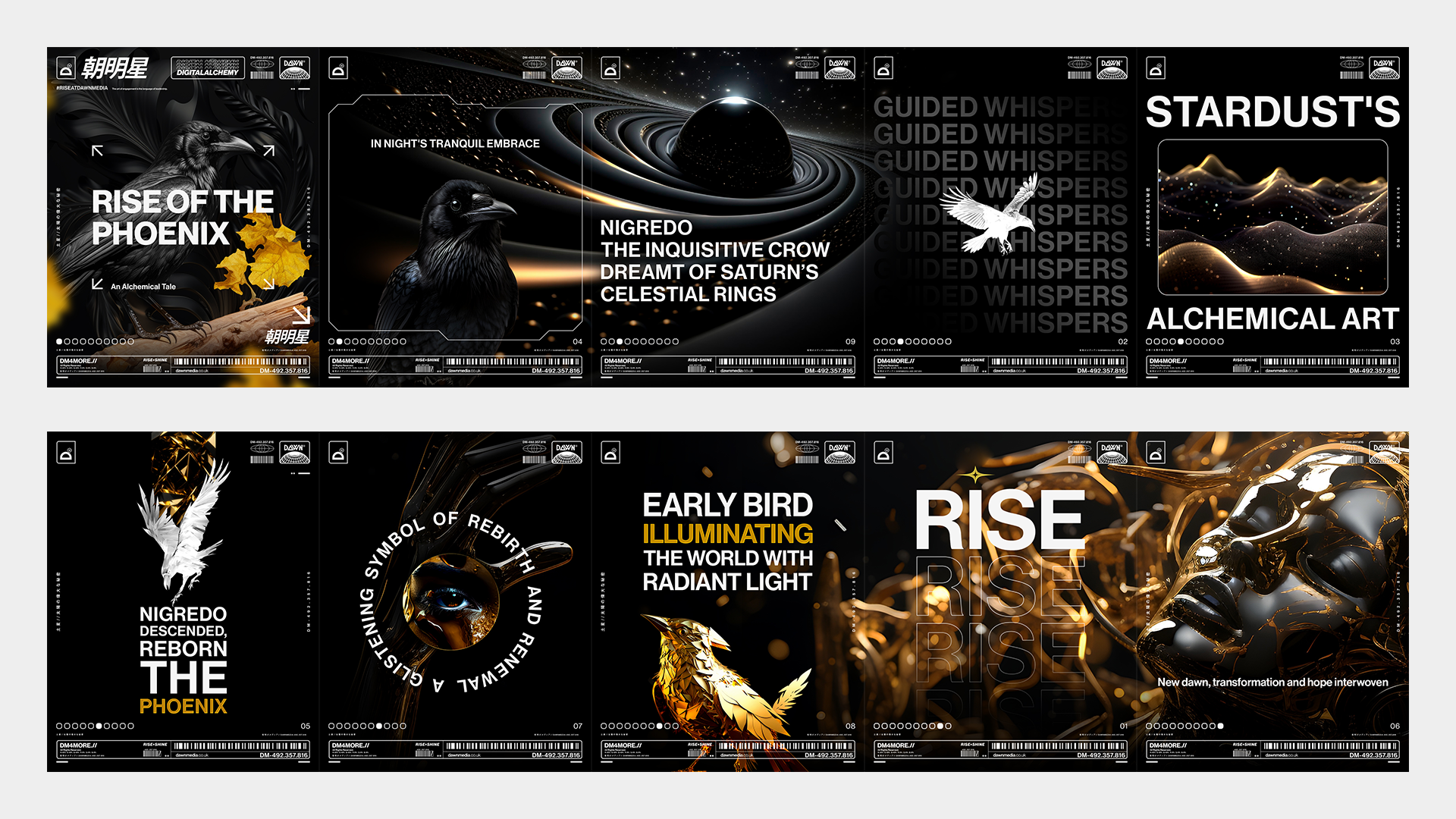
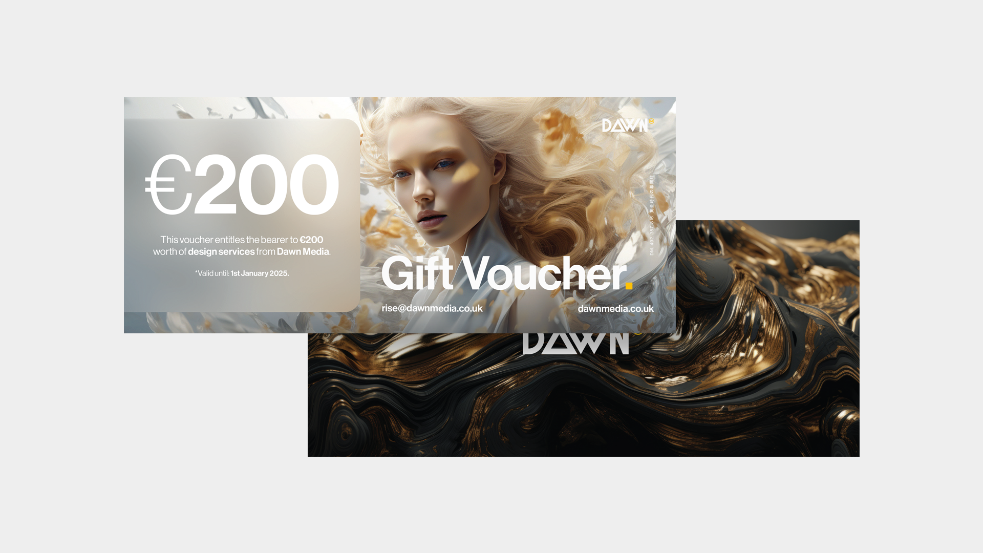
Dawn Media evolved from a summery, approachable visual identity into a confident, avant-garde presence. The brand now communicates both bold aesthetics and strategic intelligence, reflecting a design language that is modern, deliberate, and emotionally resonant. Every touchpoint, including social media, posters, and digital campaigns, reinforces clarity, perception, and the feeling that the brand is in control, intentionally guiding audience interpretation.
Project Overview
Rise & Shine
Dawn Media is a full-service creative studio specializing in brand strategy, design, and social media management. We help clients craft identities that are visually distinctive and strategically intelligent, aligning emotional resonance with business objectives.
At this stage, Dawn Media is both an operational studio and a living example of its own methodology, demonstrating the effectiveness of combining aesthetic innovation with strategic insight.
What makes the studio compelling is its dual approach. Bold, clean, avant-garde design is paired with a rigorous perception-driven framework. The brand itself functions as a showcase, reflecting both what we do for clients and how we think about brand influence.

01
The Challenge
Before the shift, Dawn Media’s identity was warm, summery, and approachable, reflecting its local roots but lacking the visual boldness and structural clarity needed to signal cutting-edge thinking. Social channels, posters, and campaigns were visually coherent but did not fully communicate authority, strategy, or innovation.
The risk of maintaining the old identity was being perceived as a boutique studio limited by style rather than a studio that could lead, guide, and influence in a fast-moving creative landscape. Without evolution, the brand risked blending into the crowded design space, limiting both perception and opportunity.
02
The Insight
The reframing came with the recognition that identity must function on two levels: aesthetics and perception. A visual refresh alone was insufficient. The brand also needed to communicate control, intelligence, and emotional resonance. Strategy had to be encoded in every design decision, influencing how audiences feel, interpret, and remember the work.
This insight clarified that Dawn Media itself should be a testbed for the approach we offer clients. The brand demonstrates bold, forward-thinking visuals supported by structural, perception-driven strategy.
03
The Strategy
The core strategic decision was to align all visual and narrative elements with a sense of deliberate, controlled modernity. The brand had to feel authoritative, progressive, and confident while remaining human-centered.
Deliberately, we did not pursue overly playful or trend-reactive styles that might dilute perception of authority. Success needed to feel purposeful and earned, signaling that every campaign and visual choice reflected intent rather than chance.
From Insight to Execution
Selected Work
Translate Strategy Into Form
Creative Intelligence
Visual system overview
01
The brand is confident, clean, and avant-garde while remaining approachable and human. Across digital, print, and social media, every touchpoint reinforces clarity, structure, and perception control.
Key design decisions and rationale
02
We explored softer, illustrative aesthetics and playful trends but rejected them. They lacked the rigor to convey authority and long-term strategic thinking. We committed to a bold, structured, minimal-but-impactful system that signals control, precision, and deliberate intent.
Tone, typography, color, imagery, motion, etc.
03
Every element, including social posts, posters, and digital campaigns, is designed to encode perception and emotional resonance. The system prioritizes signal over noise, reinforcing Dawn Media’s position as both a creative studio and a strategic authority.
How the execution supports the strategy
04
Structured and disciplined typography, clear hierarchy, restrained motion, and precise layouts. Color and imagery support narrative and emotional connection rather than decoration. The tone communicates authority while remaining human and approachable.
Design Impact
The Outcome
The evolved identity positions Dawn Media as confident, avant-garde, and strategically intelligent. Social channels now present a consistent, deliberate presence, and clients perceive the studio as authoritative and innovative. Campaigns feel intentional and emotionally resonant, establishing the brand as a model of its own approach.
Short-term impact included clearer internal direction and external perception of authority. Long-term, the identity supports continuous innovation, premium positioning, and scalable client engagement.
What Our Clients Think
Testimonials
-
![]()
★★★★★
They understood the heritage and symbolism I wanted to preserve, and translated that into a brand that feels elevated, authentic, and enduring.
—Aiste, GIJA LT
-
![]()
★★★★★
They took time to understand what my business is really about—security, trust, and professionalism—and built a brand around that. No fluff, just clean, sharp work that actually helps me stand out.
—Dan, Ambervalley Locksmiths
-
![]()
★★★★★
Dawn Media was the first design agency that didn’t try to simplify or water down my mission. They genuinely cared about the preservation of these beautiful creatures.
—Dora, Fox Guardians
-
![]()
★★★★★
The work was meticulous—everything clean, realistic, and on-brand. Turnarounds were fast, and communication was clear throughout. They deliver consistently and makes our lives easier.
—Ryder, Unsworth Sugden
-
![]()
★★★★★
The look they created is smart but not flashy, and it feels solid—like us. It’s helped us look more professional without losing that family-run feel people trust us for.
—Paul, Superior Stoves
-
![]()
★★★★★
Dawn Media was lovely to work with, they really listened, asked the right questions, and somehow turned all my scattered ideas into something beautiful and cohesive.
—Jodie, Jodie's Bakehouse
-
![]()
★★★★★
The visuals are sharp, bold, and full of movement—and they reflect my style as a coach. It gave me a huge confidence boost, and clients are responding to it.
—Maria, Maria Marikiya PT
-
![]()
★★★★★
Dawn Media has a remarkable way of translating abstract ideas into practical, elegant design. Their team helped me define AnGlophone Go’s unique position and brought clarity to how we communicate that—visually and online.
—Elena, AnGlophone Go
-
![]()
★★★★★
Building the Real English brand with Dawn Media was a game-changer. They helped me refine not just how we look, but how we show up in the world—on social media, on our site, and in how we speak to our audience.
—Charlotte, The Real English Center


Anchor The Narrative
Key Takeaway / Thesis
Strong branding combines aesthetics with perception-driven strategy. Dawn Media demonstrates that design is not only visual. It is structural, shaping emotional response and audience interpretation. Future work will continue to refine the integration of bold visual identity with perception intelligence, ensuring every touchpoint communicates clarity, control, and resonance.
The Phoenix Rises
Awaken Your Brand
You’ve seen how we think. You’ve felt the difference in our approach. Now, the path forward is clear. If you’re ready to transform your brand into a force that leads, resonates, and endures. Carpe diem, seize the day.
Let’s begin your digital transformation.