
Unity Across Borders
Establishing a Modern Identity for Lithuanian Professionals in Spain
Lithuanian Professionals in Spain moved from informal conversations and dispersed individuals to a unified, recognised organisation with a clear identity and shared purpose. The project established not only a brand, but a structure that allowed professionals and entrepreneurs to connect, collaborate, and grow together across Spain.
Project Overview
The Client at a Glance
Lithuanian Professionals in Spain is a dynamic network uniting Lithuanian professionals, entrepreneurs, and executives living and working across Spain. The organisation creates opportunities through networking events, educational workshops, business initiatives, and dialogue between Spain and Lithuania.
The community serves as a bridge between two countries, helping members integrate into the Spanish market while maintaining cultural connection to Lithuania. It exists to connect people, foster collaboration, and create meaningful opportunities for professional growth.
A defining strength of the organisation is its leadership. Co founder and Managing Director Aiste Dutkute previously served as President for three years, providing continuity, credibility, and strategic clarity during the foundation of the brand.

01
The Challenge
Before the brand was established, Lithuanian professionals in Spain lacked a cohesive community structure. Individuals were active across multiple cities but operated independently, without a unifying identity or coordinated support system.
The risk was long term fragmentation. Without a formal structure, professionals would continue navigating business regulations, cultural adaptation, and market integration alone.
In practical terms, this meant isolation, confusion around legal frameworks, limited access to trusted information, and missed opportunities for collaboration. The need for connection was clear. The system to support it was not.
02
The Insight
The breakthrough came from recognising that the community already shared the same core values: unity, ambition, and mutual support. The challenge was not motivation. It was alignment.
The deeper issue was structural. A dispersed professional community cannot organise itself without shared identity and communication tools. This generation of Lithuanian professionals had access to digital platforms and networking technologies. What they lacked was a coherent signal to rally around.
For the project to succeed, the brand needed to function as more than an identifier. It had to become a guiding principle. A visible standard. A shared symbol of belonging that aligned members under one common goal.
03
The Strategy
The core strategic decision was to balance heritage with progress. The brand needed to respect Lithuanian cultural identity while positioning the organisation as modern, future oriented, and internationally credible.
We deliberately avoided leaning heavily on traditional symbolism or national colour palettes. The objective was not nostalgia. It was forward movement. Many members were already navigating significant personal and professional change by relocating to Spain. The brand needed to reflect confidence in that evolution, not resistance to it.
Success needed to feel innovative, structured, and trustworthy. Members had to feel they were joining something stable and future ready, not simply another social group. The identity had to communicate collective strength rather than personal expression.
From Insight to Execution
Selected Work
Translate Strategy Into Form
Creative Intelligence
Visual system overview
01
The brand is future facing while grounded in cultural respect. It communicates quiet confidence and stability. The presence is measured and composed, reinforcing credibility across both Spanish and Lithuanian contexts.
Key design decisions and rationale
02
Traditional motifs and direct flag references were explored but rejected because they limited the organisation to heritage signalling rather than international positioning.
After experimentation, the decision was made not to use national flag colours. Instead, we committed to a clean, minimal visual system that avoids aligning visually with either Spain or Lithuania. This positions the organisation within a broader global design language while still honouring its roots through structure rather than decoration.
Tone, typography, color, imagery, motion, etc.
03
The design reinforces the strategic intent by being clear, collective, and unambiguous. It avoids personalisation in favour of unity.
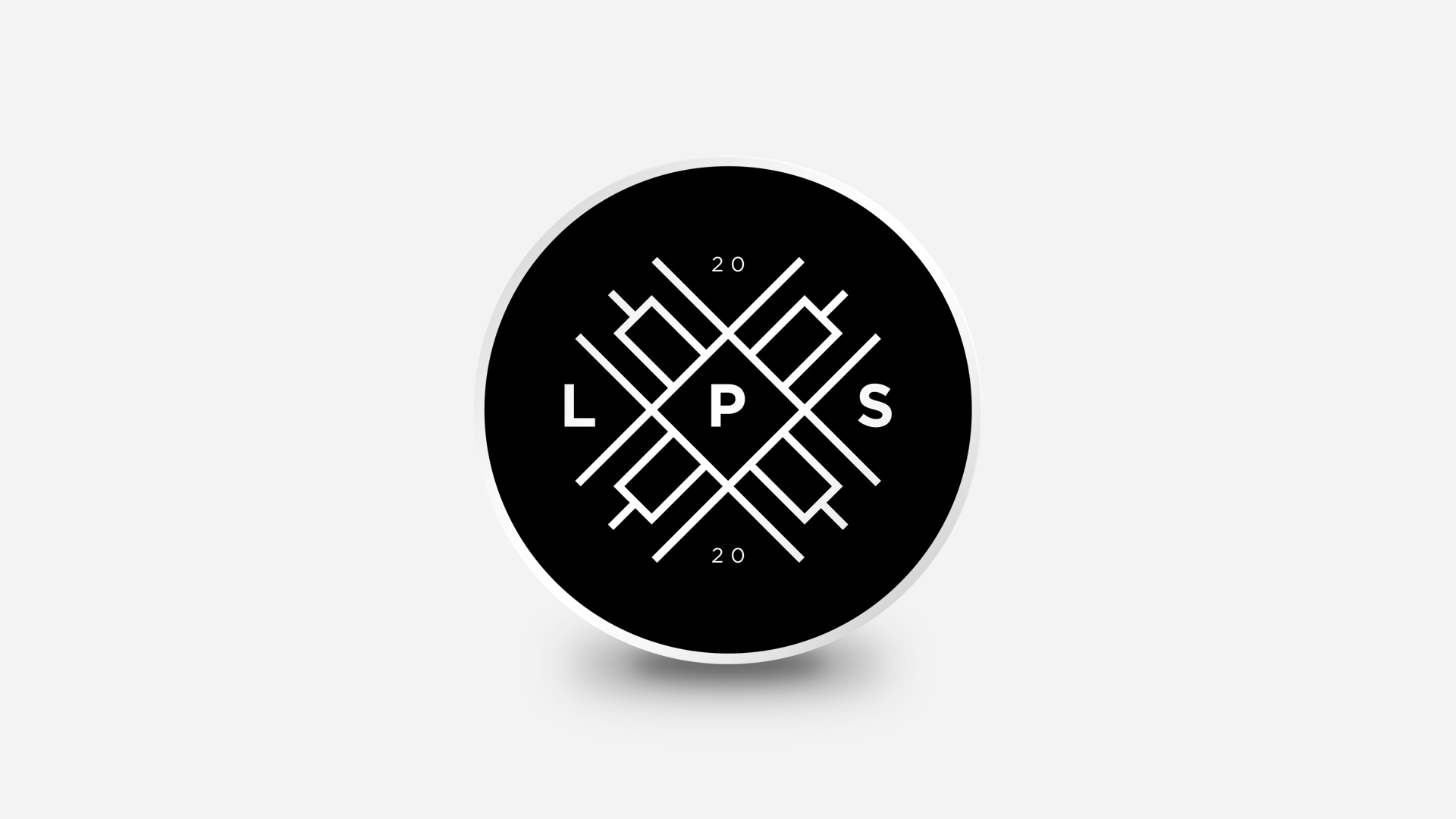
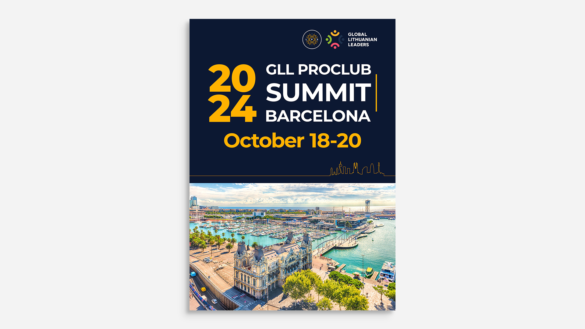
Strategy and execution meet most visibly in the logo. The mark incorporates the traditional Gedimino Stulpai pattern enclosed within a circle. The symbol acknowledges Lithuanian heritage while the circular form represents unity, inclusion, and community. Tradition is framed within collective structure.
How the execution supports the strategy
04
The visual language is neutral, precise, and globally legible, grounded in four structural principles: neutrality by construction, avoiding culturally coded palettes and decorative motifs; reduction and precision, with strict hierarchy, limited type pairings, controlled spacing, and elimination of excess; grid integrity, using a modular system to ensure consistent alignment and structure; and typographic authority, where modern, internationally legible typefaces define hierarchy through scale and weight rather than color or ornamentation.
Design Impact
The Outcome
The launch established a recognisable and respected identity within the sector. The organisation gained clarity, credibility, and momentum.
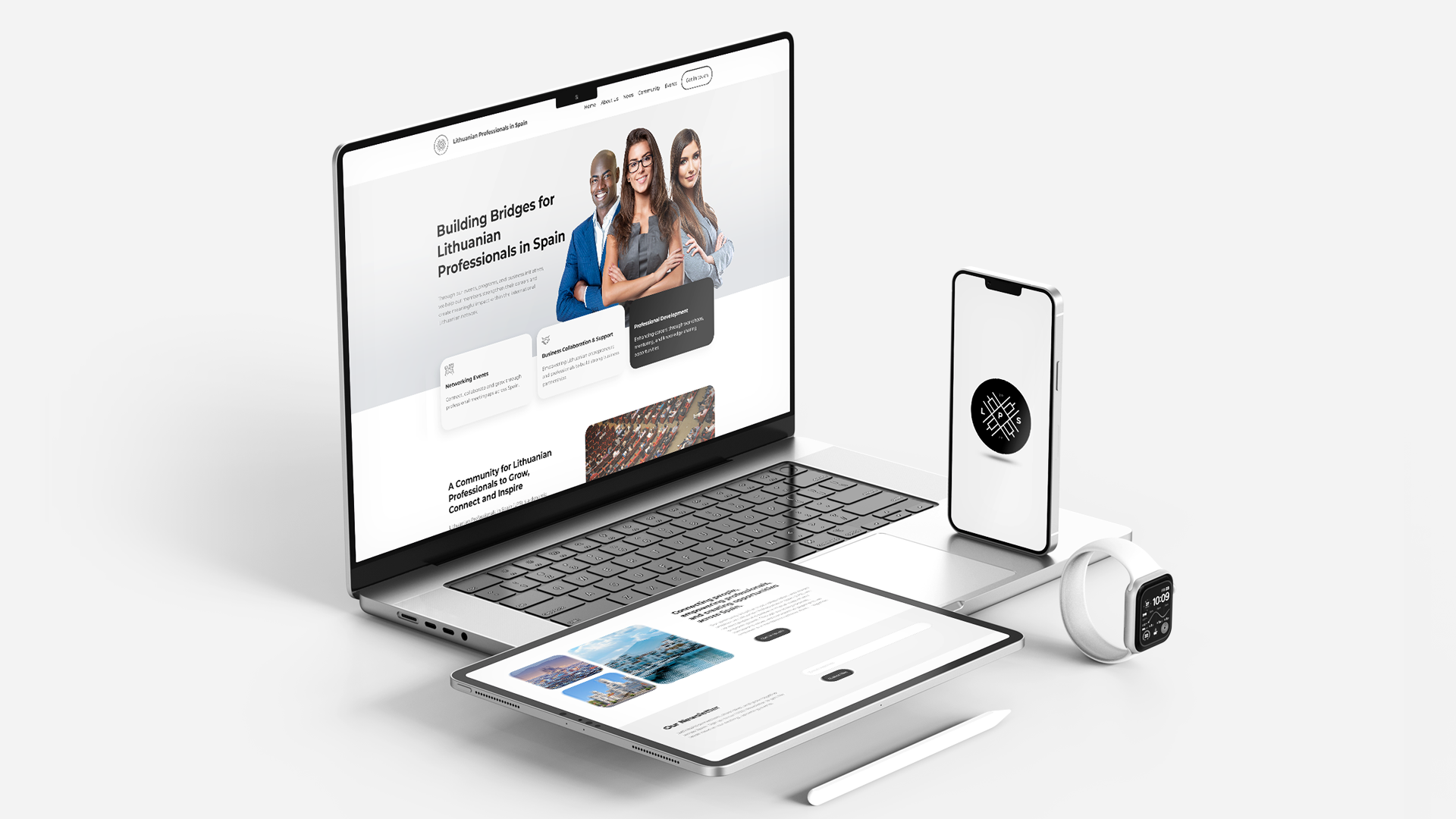
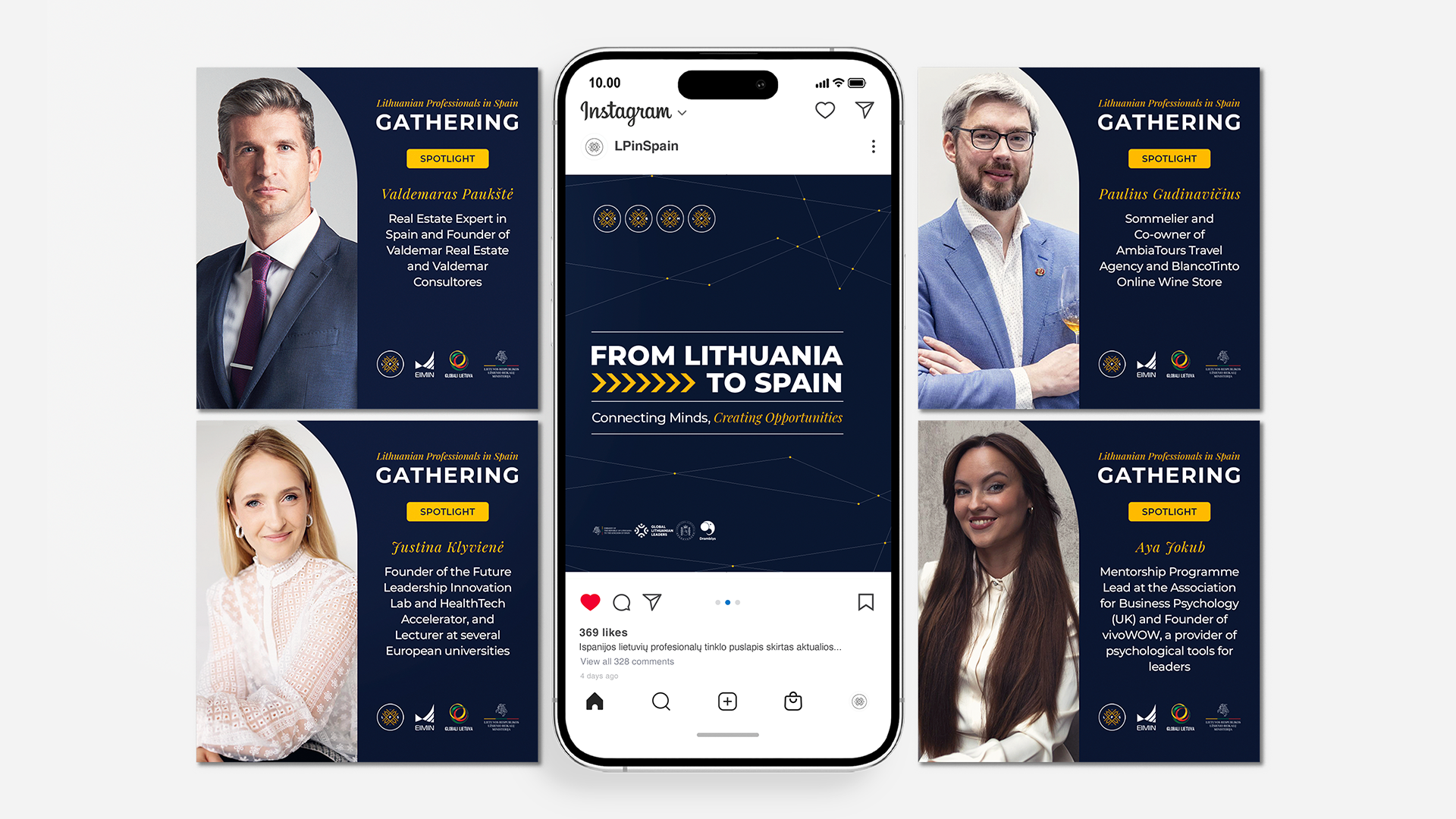
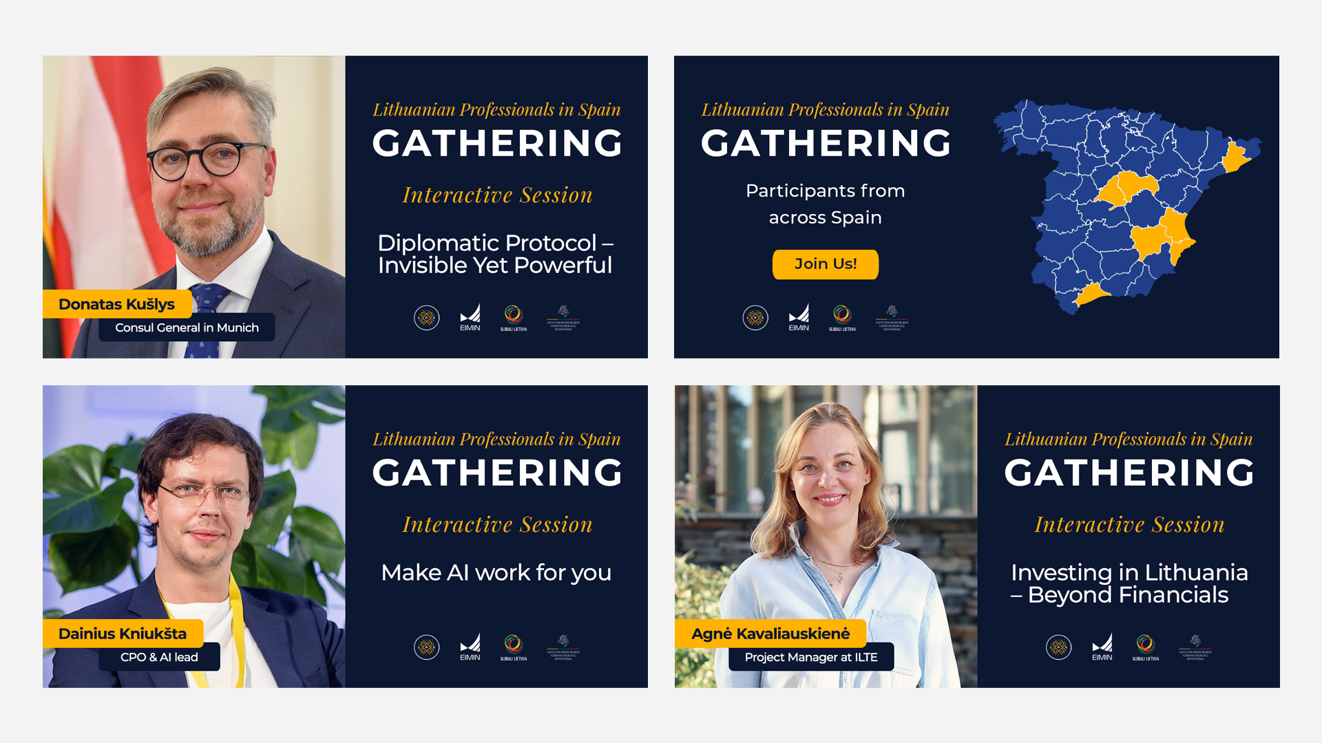
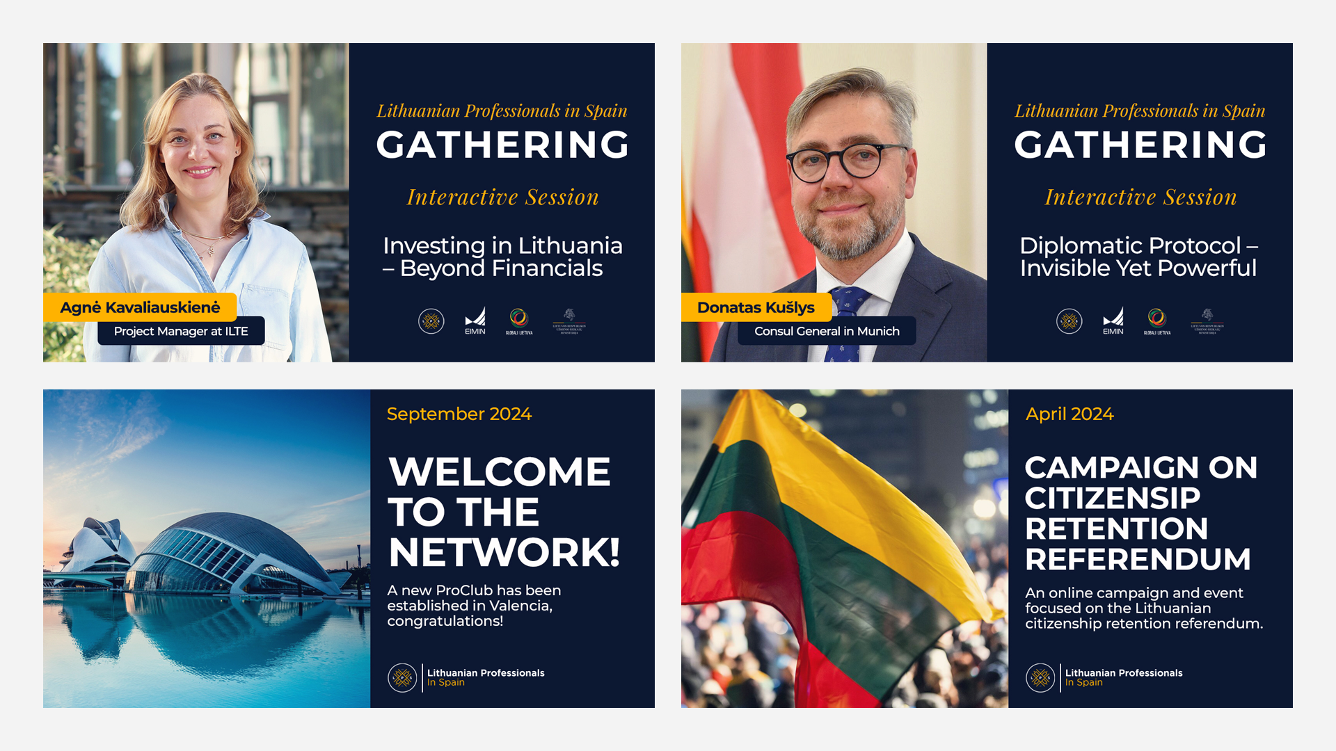
Opportunities for in person gatherings expanded. Online events strengthened connection. Relevant conversations became structured and consistent. Members felt informed and professionally supported. Growth became intentional rather than accidental.
Feedback from annual gatherings confirms that the community has become more than a professional resource. Members describe belonging, strong relationships, and long term connection. Since its founding in 2021, the organisation has grown steadily and continues to strengthen.
Short term, the brand provided members with renewed purpose and visibility.
Long term, it enables generational support for future Lithuanian professionals relocating to Spain. The organisation now has a stable foundation to sustain and expand that mission.
What Our Clients Think
Testimonials
-
![]()
★★★★★
They understood the heritage and symbolism I wanted to preserve, and translated that into a brand that feels elevated, authentic, and enduring.
—Aiste, GIJA LT
-
![]()
★★★★★
They took time to understand what my business is really about—security, trust, and professionalism—and built a brand around that. No fluff, just clean, sharp work that actually helps me stand out.
—Dan, Ambervalley Locksmiths
-
![]()
★★★★★
Dawn Media was the first design agency that didn’t try to simplify or water down my mission. They genuinely cared about the preservation of these beautiful creatures.
—Dora, Fox Guardians
-
![]()
★★★★★
The work was meticulous—everything clean, realistic, and on-brand. Turnarounds were fast, and communication was clear throughout. They deliver consistently and makes our lives easier.
—Ryder, Unsworth Sugden
-
![]()
★★★★★
The look they created is smart but not flashy, and it feels solid—like us. It’s helped us look more professional without losing that family-run feel people trust us for.
—Paul, Superior Stoves
-
![]()
★★★★★
Dawn Media was lovely to work with, they really listened, asked the right questions, and somehow turned all my scattered ideas into something beautiful and cohesive.
—Jodie, Jodie's Bakehouse
-
![]()
★★★★★
The visuals are sharp, bold, and full of movement—and they reflect my style as a coach. It gave me a huge confidence boost, and clients are responding to it.
—Maria, Maria Marikiya PT
-
![]()
★★★★★
Dawn Media has a remarkable way of translating abstract ideas into practical, elegant design. Their team helped me define AnGlophone Go’s unique position and brought clarity to how we communicate that—visually and online.
—Elena, AnGlophone Go
-
![]()
★★★★★
Building the Real English brand with Dawn Media was a game-changer. They helped me refine not just how we look, but how we show up in the world—on social media, on our site, and in how we speak to our audience.
—Charlotte, The Real English Center


Anchor The Narrative
Key Takeaway / Thesis
This project reinforced that branding can unify people across geography. Design does not simply communicate information. It creates cohesion.
A strong identity can become part of personal identity, giving individuals a shared standard and a collective voice.
In future projects, we would again prioritise universal visual language over decorative tradition. Structure, clarity, and international credibility position organisations for longevity.
With greater resources, the system could expand further across digital platforms, publications, and large scale events, deepening its impact even more.
The Phoenix Rises
Awaken Your Brand
You’ve seen how we think. You’ve felt the difference in our approach. Now, the path forward is clear. If you’re ready to transform your brand into a force that leads, resonates, and endures. Carpe diem, seize the day.
Let’s begin your digital transformation.