
Let There Be Light
Transforming an English Academy into a Vibrant, Emotionally Engaging Brand
The Real English Center transformed from a functional, practical identity into a vivid, cohesive, and confident brand presence that resonates across every interaction. Students, families, and the wider community now experience the academy as a place of pride, inspiration, and belonging. A space where learning feels exciting, participation feels celebrated, and every touchpoint, from the website and social media to in-classroom posters and merchandise, reinforces a sense of connection, energy, and shared purpose. The academy no longer simply exists as an institution; it commands attention, evokes emotion, and becomes a central part of the student and family experience, creating a lasting impression that extends far beyond the classroom walls.
Project Overview
The Client at a Glance
The Real English Center is an English language academy embedded in its local community. They cultivate a safe, inspiring environment where students of all ages learn, grow, and feel supported.
What sets them apart is the genuine care they bring to students’ journeys. Every lesson, interaction, and communication reflects their commitment to connection and growth, making them a client whose ethos is ready to be amplified through design.

01
The Challenge
The academy had a foundation of good teaching and loyal students, but the way it expressed itself visually and verbally didn’t communicate the depth of its value. The previous identity functioned, but it lacked emotional resonance, cohesion, and presence. Elements that truly signal confidence and authority in the community.
This created an opportunity: to make the academy’s personality impossible to ignore, to transform functional communication into experiences that evoke pride, belonging, and enthusiasm.
In practical terms, the academy needed its identity to work across multiple touchpoints. From logos and posters to social media campaigns, in a way that felt unified and emotionally compelling. The challenge was not the teaching; it was the perception of the teaching.
02
The Insight
Through observation, it became clear that the students and their families already carried a sense of loyalty and pride; it just wasn’t reflected in the academy’s communications.
The key insight: people respond first to the signals of identity, then to information. Messages, visuals, and touchpoints must feel meaningful before they are read. To truly connect, we had to translate the intangible qualities; excitement, pride, belonging, into every element of the brand. From the logo to posters, from digital campaigns to social media feeds.
For success, the brand needed to make every interaction feel deliberate, elevating the ordinary into something emotionally magnetic.
03
The Strategy
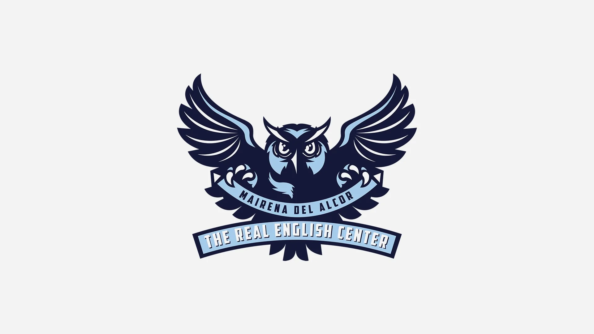
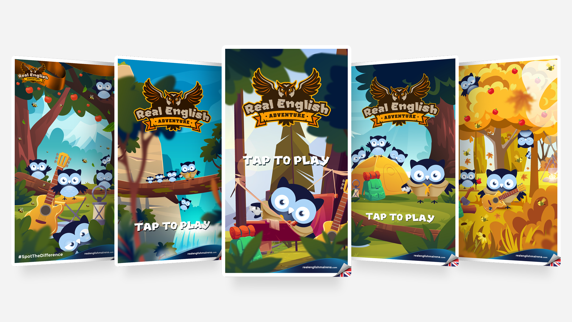
The strategy was to create an identity that celebrates school spirit and community, inspired by the energy of collegiate environments, with a mascot to anchor loyalty and recognition. Every visual and verbal choice was designed to make the audience feel part of something bigger than themselves.
Deliberately, we avoided conventional “school” imagery that would signal formality without emotion. Instead, the identity was designed to signal vitality, confidence, and tradition simultaneously, ensuring the academy was seen as both professional and fun.
Success was measured not by visual polish alone, but by the sense of enthusiasm and belonging that the identity generated across students, families, and the wider community.
From Insight to Execution
Selected Work


Translate Strategy Into Form
Creative Intelligence
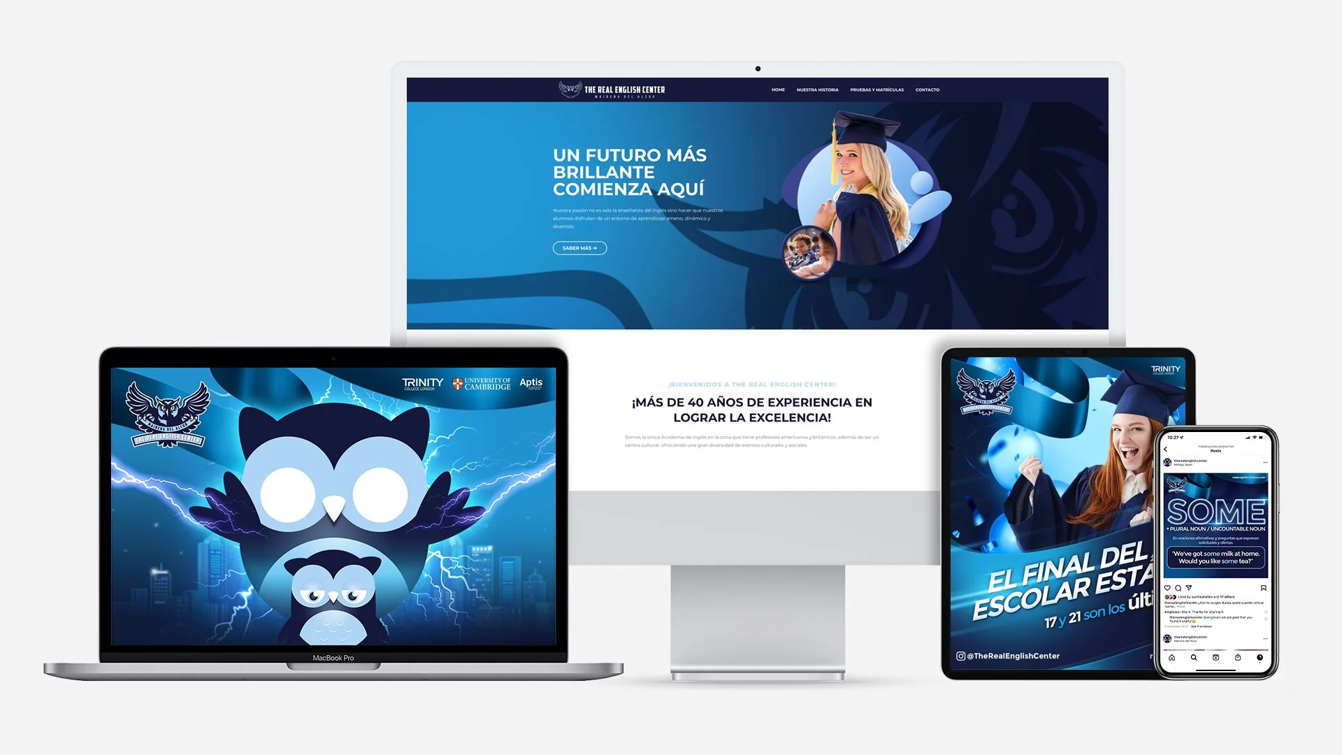
Visual system overview
01
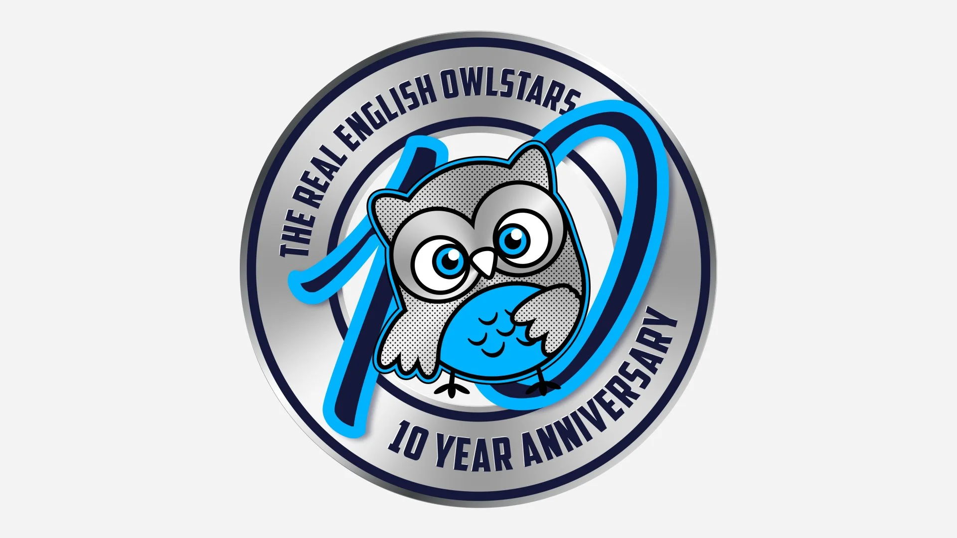
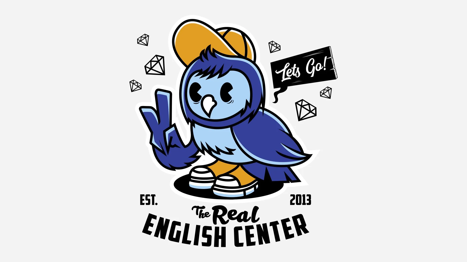
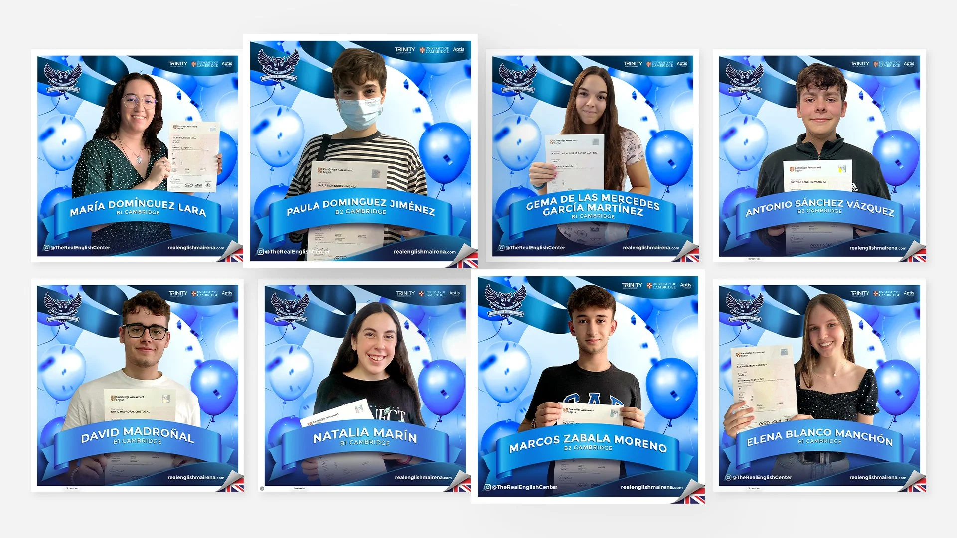
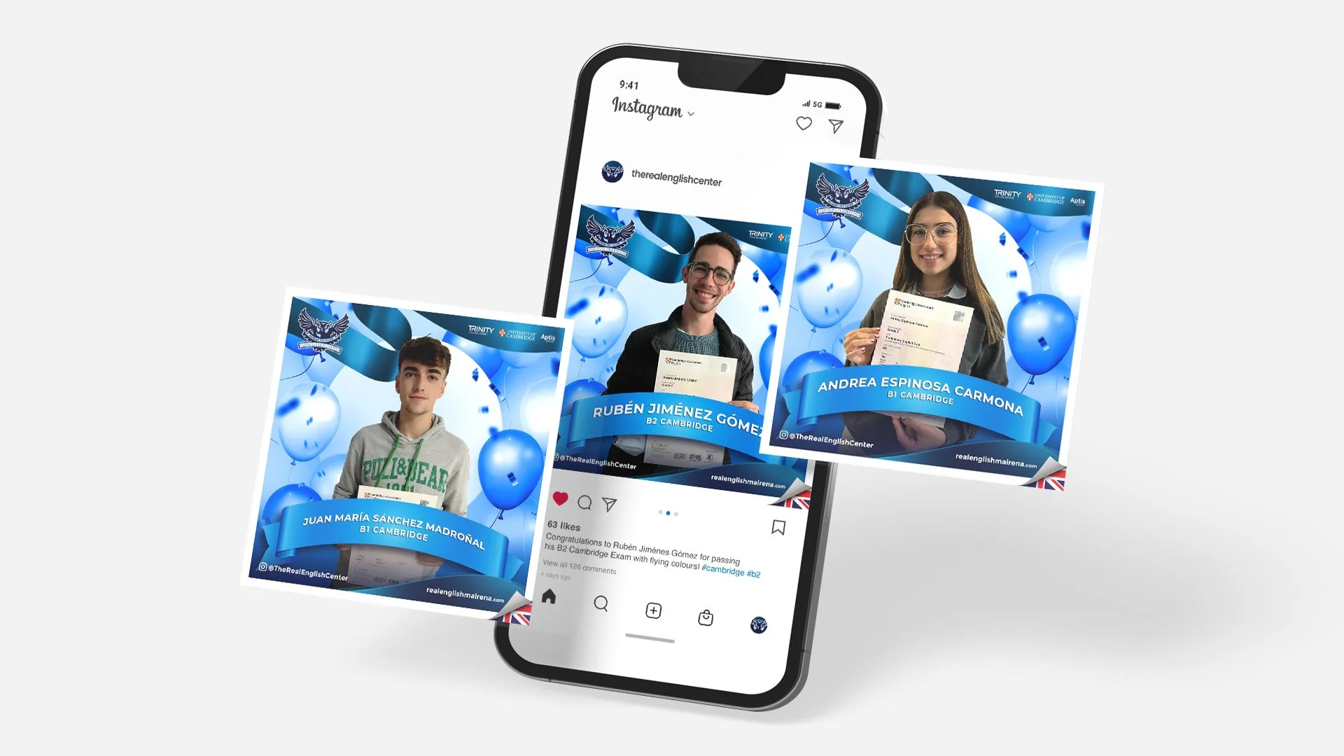
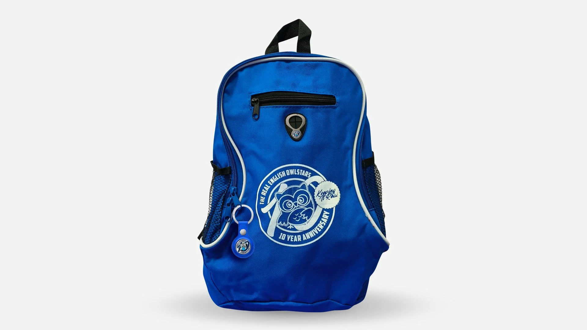
The brand maintains a confident, iconic presence across all touchpoints, anchored by the owl mascot, which conveys intelligence, loyalty, and pride. Identity elements work dynamically across print, digital, and physical spaces, reinforcing community and belonging.
Key design decisions and rationale
02
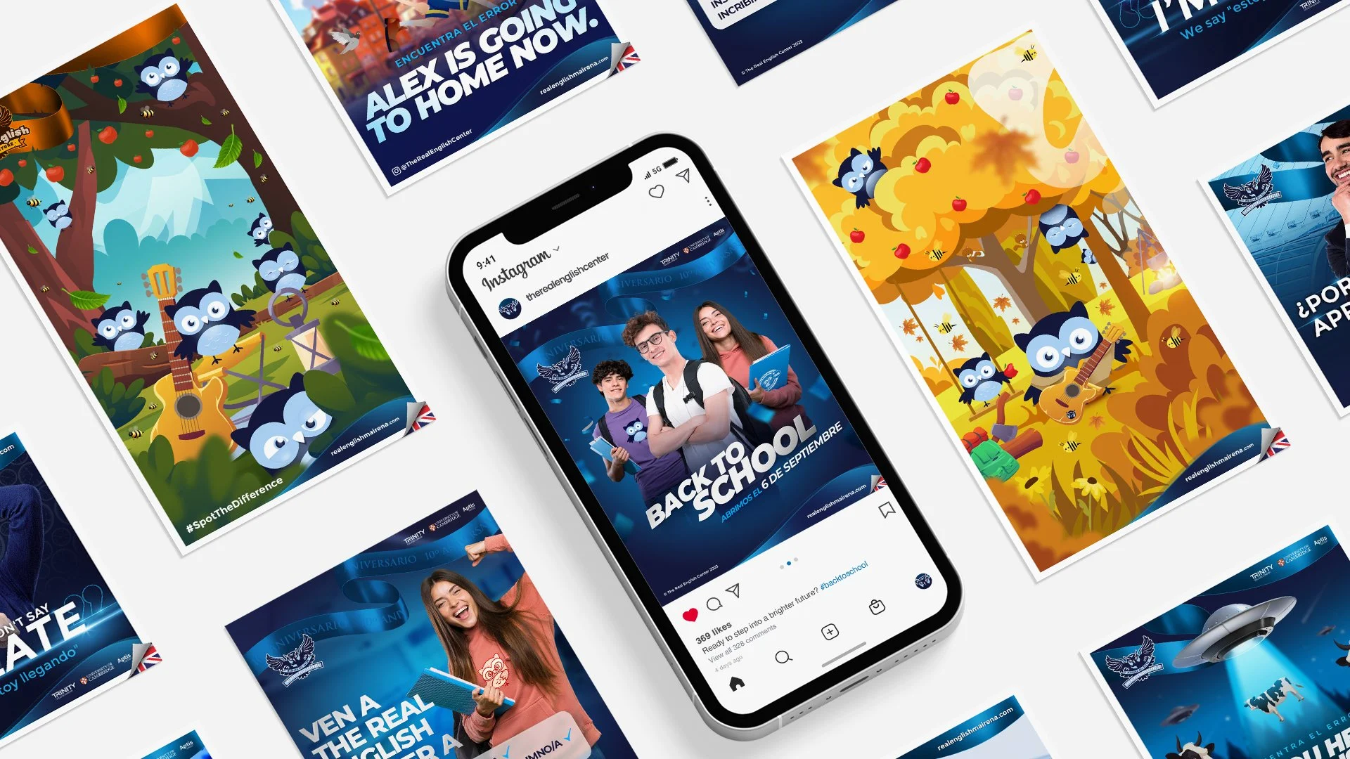
Emotional impact guided the aesthetic over strict tradition, drawing from American collegiate visual language to evoke school spirit. Mascot-led branding, dynamic typography, and sports-inspired graphics create excitement, while hierarchy, balance, and alignment reinforce trust and authority.
Tone, typography, color, imagery, motion, etc.
03
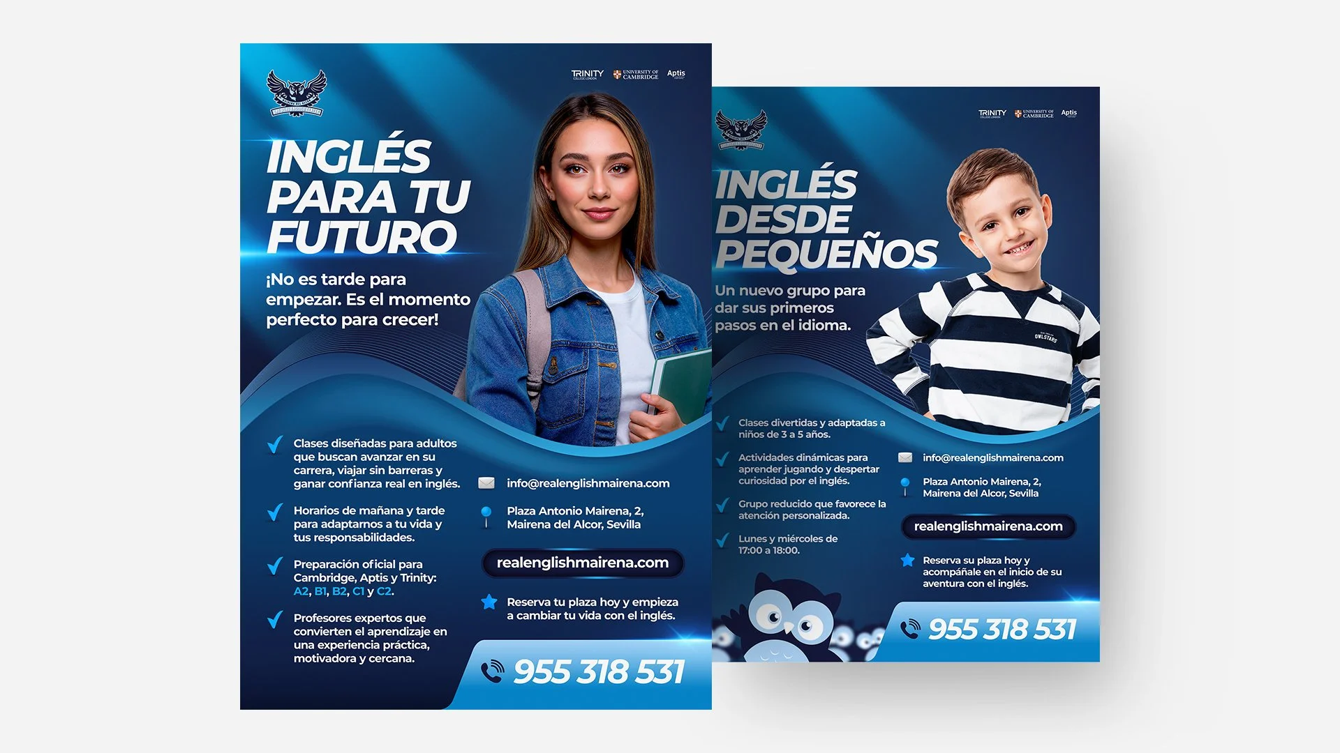
Logo, branding, and digital touchpoints communicate unity and pride. The website guides prospective students emotionally, while social media, ads, and content maintain ongoing community engagement. Posters and in-academy materials extend the experience offline, creating a seamless brand ecosystem.
How the execution supports the strategy
04
The visual language blends athletic cues with campus culture, using typography and color to ensure readability, hierarchy, and energy. Consistent motion graphics, ads, social posts, and posters align perception with strategic intent.
Design Impact
The Outcome
The new identity generated strong engagement, immediate recognition, and a sense of pride that extended to families and the broader community. In the short term, it boosted social media followers, increased student engagement, and enhanced perception of the academy as an inspiring, professional institution. Over the long term, it strengthened regional positioning, supported sustainable growth, and created a visual and emotional framework capable of evolving with the academy. Central to this success, the mascot and cohesive visual system transformed everyday interactions into emotionally charged experiences for students and families alike.
What Our Clients Think
Testimonials
-
![]()
★★★★★
They understood the heritage and symbolism I wanted to preserve, and translated that into a brand that feels elevated, authentic, and enduring.
—Aiste, GIJA LT
-
![]()
★★★★★
They took time to understand what my business is really about—security, trust, and professionalism—and built a brand around that. No fluff, just clean, sharp work that actually helps me stand out.
—Dan, Ambervalley Locksmiths
-
![]()
★★★★★
Dawn Media was the first design agency that didn’t try to simplify or water down my mission. They genuinely cared about the preservation of these beautiful creatures.
—Dora, Fox Guardians
-
![]()
★★★★★
The work was meticulous—everything clean, realistic, and on-brand. Turnarounds were fast, and communication was clear throughout. They deliver consistently and makes our lives easier.
—Ryder, Unsworth Sugden
-
![]()
★★★★★
The look they created is smart but not flashy, and it feels solid—like us. It’s helped us look more professional without losing that family-run feel people trust us for.
—Paul, Superior Stoves
-
![]()
★★★★★
Dawn Media was lovely to work with, they really listened, asked the right questions, and somehow turned all my scattered ideas into something beautiful and cohesive.
—Jodie, Jodie's Bakehouse
-
![]()
★★★★★
The visuals are sharp, bold, and full of movement—and they reflect my style as a coach. It gave me a huge confidence boost, and clients are responding to it.
—Maria, Maria Marikiya PT
-
![]()
★★★★★
Dawn Media has a remarkable way of translating abstract ideas into practical, elegant design. Their team helped me define AnGlophone Go’s unique position and brought clarity to how we communicate that—visually and online.
—Elena, AnGlophone Go
-
![]()
★★★★★
Building the Real English brand with Dawn Media was a game-changer. They helped me refine not just how we look, but how we show up in the world—on social media, on our site, and in how we speak to our audience.
—Charlotte, The Real English Center


Anchor The Narrative
Key Takeaway / Thesis
Great design does more than communicate — it shapes perception and behavior, making strategy felt rather than merely explained. For The Real English Center, emotional engagement drives identity, ensuring the academy’s personality, pride, and sense of community are visible before a single word is read. Authority, clarity, consistency, and trust are reinforced through visual rhythm, hierarchy, and repetition, while every graphical touchpoint works in unison to create belief and excitement.
Future refinements to the mascot and digital presence will continue to elevate emotional resonance and long-term loyalty. In this way, design, strategy, and perception coalesce, making the academy’s values instantly understood, celebrated, and shared, creating an identity that is not only seen but truly felt.
The Phoenix Rises
Awaken Your Brand
You’ve seen how we think. You’ve felt the difference in our approach. Now, the path forward is clear. If you’re ready to transform your brand into a force that leads, resonates, and endures. Carpe diem, seize the day.
Let’s begin your digital transformation.